
Android app development frameworks is good, really good. It is very flexible and allows devs to do nearly anything they want. The flexibility extends to design as well as developers are able to implement crazy designs make the apps work. But! Not everything is worth doing. Often, the components provided by the framework are better. They look better, feel better and users know how to use them.


Take time to familiarise yourself with the way Android apps use tabs. The default tabs and interaction with them is very well thought out. Users expect then to work similarly they work in other apps.
Not only do the framework tabs look great but using them gives you a lot of features for free. Remember that tabs on Android should be swipable. They should also adapt to wider screens by moving them to the action bar if there's room. This saves a lot of vertical space when user uses the device in landscape. They are also easily stylable. You can change all the colours to match your brand. Try Google IO app to see how Android framework tabs work (and are expected to work).


If your app uses a title bar consider using an action bar instead. Your app will instantly look like it belongs on Android.


By including an action bar to your app you'll save considerably in design as many design decisions are already made (and tested!) for you. You'll also save a lot of time in development phase. Any apps targeting Android 3.0 or newer can use the action bar implementation directly from the framework and if you want to support older apps ActionBarSherlock is a great library for you. The ABS library gracefully steps aside when the app runs on a device that has action br support and therefore apps behave exactly right on newer platforms as well.
Another simple thing that is to be avoided is right carets in tappable items when there's clearly no confusion that they're tappable (UEFA app below). These things don't add any value in most cases. If you have a homogenous list of items that are all tappable that's what users are going to do. Just drop them from your design and your app will look better.
Boxed text fields are the past (BMW Drive now below). Try to avoid using them in your apps. Seeing text fields like these in apps immediately makes your app feel like it was designed years ago.


Use the selection mode in action bar instead. This way users see what they're doing. It's simple and elegant solution. Users will see which items they're manipulating and there's much lower risk for mistakes.

 Web apps belong to a browser. Make your app a native app and ignore hybrid tools like PhoneGap and don't wrap your website into a WebView and release it to Google Play. Cross-platform frameworks promise a lot of savings as you can write an app once and run it on iOS and Android or they promise that you can use your web development skill to build apps. In the long run these tools just harm your brand and waste your time. So many developers have moved from these tools to native development after first wasting months trying to build something acceptable and finally realising that PhoneGap and other tools like it simply produce garbage.
Here are few tips about components that are better left alone than reimplemented. Things not to do in Android app design / development.
Re-skinning everything
Some designers are in an opinion that if any part of an original app theme is visible the app is not designed. Re-skinning every single component on Android is not necessary. While well re-skinned apps might look great and even feel like part of the platform it definitely adds a massive amount of work for bot designers and developer. It simply isn't worth it. Start your design from Holo theme and change things you need to change and leave components that work fine without changing stock.
Badly re-skinned apps are disasters. These apps don't feel like they are meant to be used on Android. Take a look at the screenshots below. This app is over designed. Every single component behaves strangely and looks strange. Don't do this!


Take a look at the building blocks Android provides you and use them as much as possible. Some good examples of right way styled apps are Player FM and Pocket Cast.


2.3 / iOS style tabs
Tabs in Android apps are very identifiable and stylish by default. Don't bring other platform tab design to your app. This is one of the quickest ways to make sure that your users will have a very bad first impression of your app. Never do this!


Take time to familiarise yourself with the way Android apps use tabs. The default tabs and interaction with them is very well thought out. Users expect then to work similarly they work in other apps.
Not only do the framework tabs look great but using them gives you a lot of features for free. Remember that tabs on Android should be swipable. They should also adapt to wider screens by moving them to the action bar if there's room. This saves a lot of vertical space when user uses the device in landscape. They are also easily stylable. You can change all the colours to match your brand. Try Google IO app to see how Android framework tabs work (and are expected to work).


Non-standard action bar
Action bar is one of the key UI components of most Android apps. There are apps that don't need to have an action bar but most apps do. Follow the design guidelines with action bar! Do not try to reinvent the wheel. Action bar has multiple function. It gives user context information, helps with navigation, helps branding the app and provide access to most important functionality of any screen.If your app uses a title bar consider using an action bar instead. Your app will instantly look like it belongs on Android.


By including an action bar to your app you'll save considerably in design as many design decisions are already made (and tested!) for you. You'll also save a lot of time in development phase. Any apps targeting Android 3.0 or newer can use the action bar implementation directly from the framework and if you want to support older apps ActionBarSherlock is a great library for you. The ABS library gracefully steps aside when the app runs on a device that has action br support and therefore apps behave exactly right on newer platforms as well.
Rounded text containers, boxed text fields and list carets
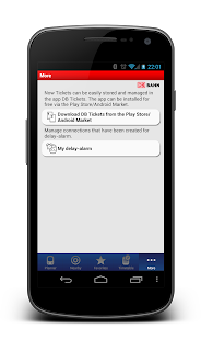
Panel backgrounds with shadows and rounded corners simply don't belong to Android. Do this and nobody will believe that you or your designer knew Android platform (DB app below).Another simple thing that is to be avoided is right carets in tappable items when there's clearly no confusion that they're tappable (UEFA app below). These things don't add any value in most cases. If you have a homogenous list of items that are all tappable that's what users are going to do. Just drop them from your design and your app will look better.
Boxed text fields are the past (BMW Drive now below). Try to avoid using them in your apps. Seeing text fields like these in apps immediately makes your app feel like it was designed years ago.


Quick actions replacing content
Quick action menus which replace the content when opened are bad user interface design. There's a very simple reason why: you don't want to hide the target of the contextual actions! I don't understand why Twitter is doing this. It does not make any sense! dont' force users to remember which line they selected.


Use the selection mode in action bar instead. This way users see what they're doing. It's simple and elegant solution. Users will see which items they're manipulating and there's much lower risk for mistakes.

Apps that feel like a website
Take the time to learn native. If your project does not have budget to build a native Android app build a proper web app and keep it as a web app and build an Android app once the budget is found. Web apps are great but wrapping them as apps is just stupid.
No comments:
Post a Comment