
 It is not often when you run into an app that demonstrates both best and worst design and implementation out there. But Yahoo! has done it with their weather app for Android. This app is a sad example of what ignorance of the platform and its guidelines can do to an app that has a massive potential to be one of the all time greats.
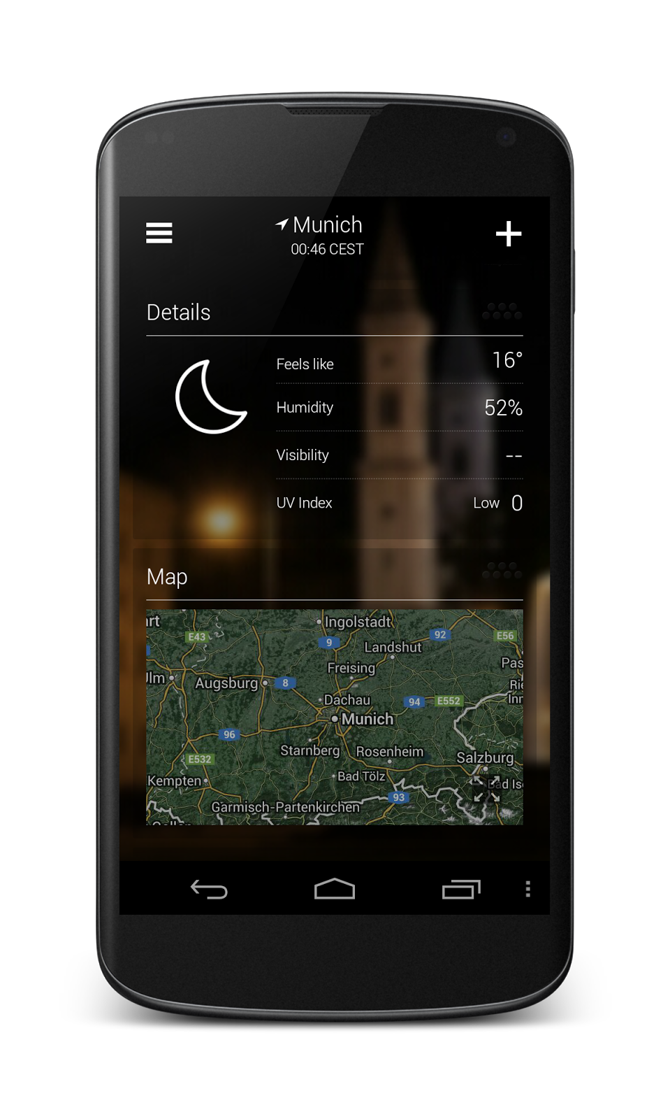
On the surface the Yahoo! Weather app looks good, really good. It pulls a great graphic automatically from Yahoo!'s flickr service and shows visually pleasing screen with weather information to the user. When you scroll down a nice parallax effect and blur filter make it a very pleasant and delightful first experience.
If you're interested of weather in another city you can easily add it and be positively surprised when scrolling the view on one city keeps the other ones in sync so you can easily compare any information between you cities of choice. Brilliant!


But then you use the app a bit more and it just doesn't feel right. Why? It is graphically beautiful, probably one of the most beautiful apps I've seen on Android but it just isn't Android app all the way through.
Let's go through the issues in the app one-by-one and see how they could be fixed.
Menu button of shame
Ok, this is an easy one. Why does the app show the legacy menu button? It doesn't even do anything!

Icons in the app
The app uses iOS icons and icon style.

Fix: Don't do this. There's commonly used icons for settings and especially for sharing. Use them!
 Navigation drawer

The app's navigation drawer is simply wrong. It mixes up too many different things. I can see the push for other Yahoo! apps an important business goal but putting especially putting the "More Apps" link into the navigation drawer just doesn't work. It also uses an iOS style "hamburger" icon for the drawer and the drawer interaction is off. In fact, using the drawer makes me wonder if this app is native or using a 3rd party framework.
The drawer is also extremely ugly. The otherwise beautiful app is badly damaged by this design.
Fix: Read the Android design guidelines for the navigation drawer and use the the provided components in the app. Replace the hamburger icon with the Android navigation drawer indicator and redesign and prioritise the items placed into the drawer again.
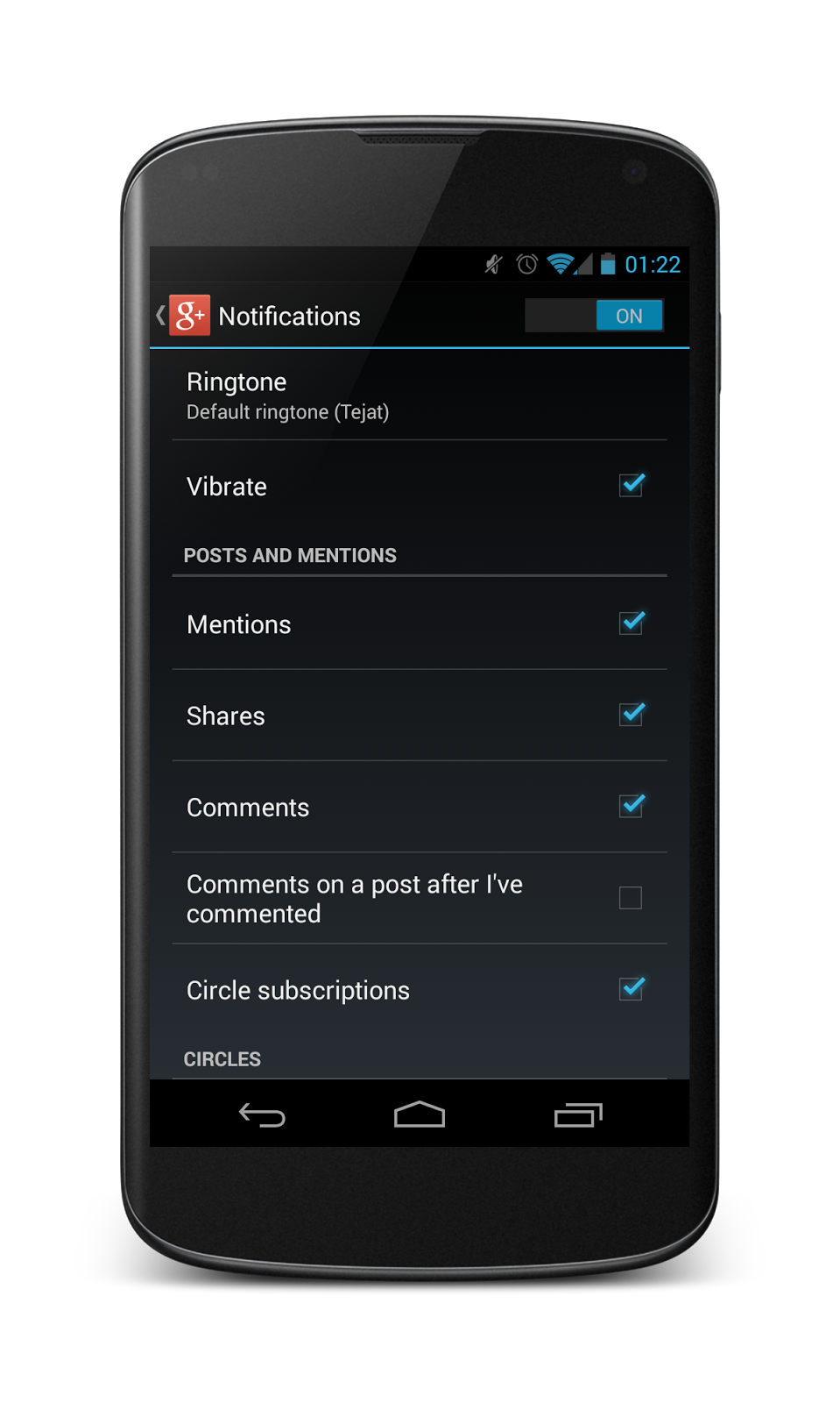
Settings screens
The settings screens don't feel like an Android app at all. There's absolutely no reason why these screens need to be this heavily customised. Your users are using many, many Android apps that use the default settings controls and this app should use them too. Settings screens don't need to be branded!
The problems with the settings don't stop with just the look. The UI components used in these screens behave wrong and the interaction model is wrong. On Android you don't need a "Done" button on these screens. Users use back button when they're done. Other massive problem is the hit areas of these components. The radio buttons on the notification settings screen react only yo taps on the actual buttons and not the labels. The checkbox on the settings screen doesn't have a down state.


Your settings screen should look & feel something like this. You get this for free:
Hiding the status bar
The app hides the Android status bar. Never do this. There's never a reason to do it. It's simply arrogance to think that users only use your app and don't care about what else is going on in their phone.
Fix: Just don't hide the status bar - ever.
Splash screen
Before user sees what they want to they're forced to stare at a splash screen. This is another thing that should never be done. It's just annoying and doesn't add anything.
Fix: Remove the splash screen and never add it into any apps again.
Landscape orientation
This is a bit strange one. The app isn't actually locked in portrait but you just can't do anything if your device is in landscape. It turns into a weather display. I'm not certain what the idea behind this design decision was but I'm afraid that it isn't quite working as intended. While I don't think this is a disaster I think it could be better.

Fix: Use Android daydreams to achieve this kind of non-interactive weather display feature.
Sharing intent
For some reason the app implements its own intent picker dialog when sharing the app. They've even added a very crude and frankly unprofessional animation to the dialog when populating the sharing options.
(left: the Yahoo! weather app intent picker dialog, right: Android default dialog)


Fix: Use Android's default intent picker dialog. There's very rarely any reason to implement your own.
Screen density issues
The app seems to suffer from some problems when handling device screen densities. Now, this could be a conscious decision to make the app much larger on larger screens but it just doesn't feel right on my 10" tablet.Left: Nexus 4 on top of a Galaxy Tab 10.1. Right: Nexus 4 on top of Nexus 7 (2012)


Fix: Make sure that you're defining all measurements in DPs and never in absolute pixels.
Thoughts and conclusion
This app makes me sad. Part of it is absolutely brilliant. I love the main screen and the information shown. I adore the subtle parallax effects when I scroll down for more info or when I swipe between cities. But then the rest of the app is absolutely destroyed by either ignorance or deliberate ignoring of Android platform and its guidelines. The app is full of amateurish mistakes (like the menu button) and strange design choices (like the iOS share icon). Then there are the big issues like the drawer navigation and settings implementations. This is yet another iOS app on Android. Or maybe a cross-platform framework destroying Android UX again?Brilliance turned into garbage by trying to save time. Sad.
[UPDATE:] It looks like this post has been linked from non-technical sources and been taken out of it's intended context (ie. this blog's context). I wrote a quick followup describing the reasoning behind this post here.
No comments:
Post a Comment