
Tasks app is something I've been using as an example of great and simple Android app in many occasions. It's one of the apps that took the new Android design and implemented it in it very basic and in the simplest form possible. I've used it as an example what to do when you don't have access to a lot of design resources.
Now, the same team has released their next app. And it is beautiful!


Before reading further get the app from Google Play for free. There's so many things in the app that can't be shown in screenshots.


There's already a very functional switch component in Android, why replace it. There's also tons of great looking icons like the trash bin, why recreate them. Reskin, recreate icons only when needed. Use the standard ones when you're doing standard actions. Users know them.


Even the app website is great. The team has taken the time to showcase their app with animated images and well sectioned feature descriptions. But what is most striking to me, as an Android fan, on their website is the fact that they've used multiple different devices to showcase the app. I'd love to see this from more people.

Now, if you haven't yet, go to Google Play and get yourself the app that defines the next generation of Android design: https://play.google.com/store/apps/details?id=ch.bitspin.timely
Now, the same team has released their next app. And it is beautiful!


Before reading further get the app from Google Play for free. There's so many things in the app that can't be shown in screenshots.
Design guidelines
The timing for this app release is perfect. There's a lot of discussion about Android guidelines and what following them means. Even Matias Duarte chimed in. This all, of course, relates to release of the very beautiful Yahoo! Weather app and the strong reaction to criticism of it.
Many seemed to think that following design guidelines somehow limits creativity or makes all apps look the same. That's absolutely not true and Timely Alarm Clock app is the best example of this ever released.
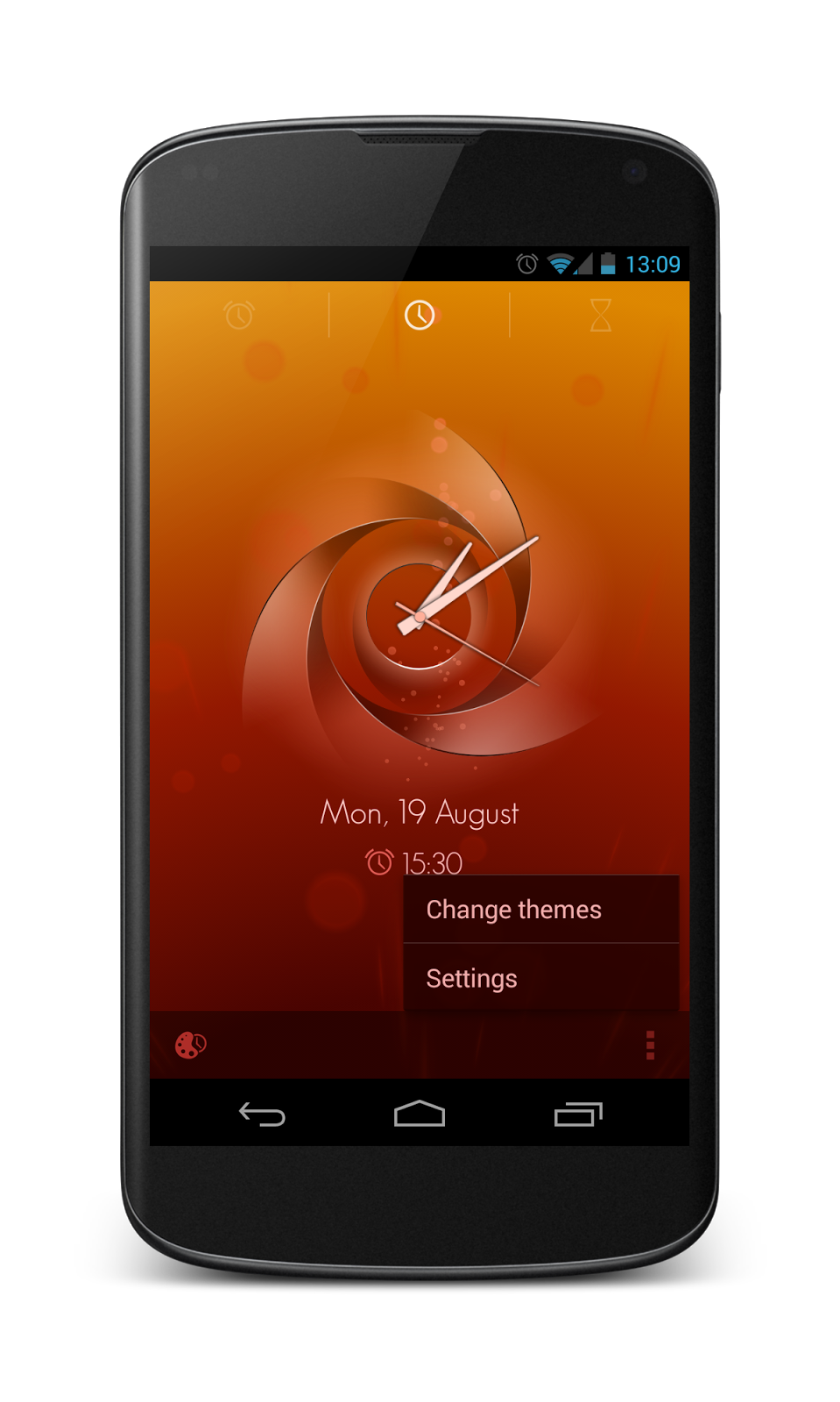
The Timely Alarm Clock app follows the Android design guidelines on every screen. Any Android user feels home in the app from the initial launch but it is beautiful. It most certainly doesn't look the same as other apps.
Pushing the boundaries
Another misconception about the design guidelines is that if you follow them you're bound to using only the standard components provided by the platform. That's not true either.
The Timely Alarm Clock app team has created a new and novel way to set the alarm time. On the app's main screen user can pull from the left-hand-side time bar to create a new alarm. This is not done in any app in the Google Play (as far as I know). It's a new idea and it works.


There's absolutely nothing wrong in creating this kind of new interaction. There's, however, an issue when it comes to new thing. Discoverability. If you do things that are common on the platform you can trust that users know how to use them but when you're creating something completely new you have to guide users a bit more. The app team does this perfectly as well. I've seen apps that try to explain how their app works by using popups. Never do that! Guide in context instead. Do what this app team has done. The available actions are explained in context and user is not blocked by the instructions.


Don't reinvent the wheel
Despite the tons of new innovation and beautiful design in the app the app team uses standard Android components, icons and design patterns where applicable.UI components and icons


There's already a very functional switch component in Android, why replace it. There's also tons of great looking icons like the trash bin, why recreate them. Reskin, recreate icons only when needed. Use the standard ones when you're doing standard actions. Users know them.
UI design patterns
I love the fact that the app doesn't use a full action bar. Somehow for some people action bar has become a "have-to-have" component in every single app. It's just a design pattern. As everything else, Use it only if you need (but if you need it use the standard implementation!). This app does use bottom part of the split action bar though. It allows the app to show actions on each screen and creates a place for the overflow menu.
It is worth noting that when the app needs the top action bar to be there it appears. For example, when handling selected items the action bar is shown as that is what users would expect.

There are other patterns many of you would recognise as modern UI patterns introduced by the Google's Android team.


Settings
There's a standard way of doing settings in Android. Why change it? The app users are comfortable with the way settings are done in most apps so keep it that way and save yourself a lot of development and design time to be used in more interesting parts of the app.

Large screens
No Android app is good unless it works across many different screen sizes. Timely Alarm Clock delivers in this front as well. On larger screens, when there's space, the middle tab of the app is always visible. This is a genious approach for using the available space.


All the other screens adapt nicely as well.


Animations and transitions
The app is not only beautiful. It's delightful. Every time you tap on anything you get an immediate feedback of what you're doing in form of a pleasant animation. Each screen transition is well thought out and masterfully implemented.
In some apps animations are taken too far and merely cause motion sickness to users. Not so in this app. Everything is just right. Animations are smooth and short. They all serve a purpose to make user either have a better sense of structure in the app or convey a message of an action. This is how animations should be done.
Make no mistake. Animations are difficult and even dangerous. Adding animations to apps don't improve the app unless the animations are extremely carefully designed. Often it is better not to add animations unless you have the resources to make them as perfect as they are in Timely Alarm Clock app.
Technology
The app is not only well designed but it is technologically excellent. It automatically syncs your alarmas between devices and doesn't seem to consume much battery. This makes the app even better as an example of the best design on the platform. Functionality and design is not either or. They can live in the same app!
Polish, polish, polish
Everything in this app screams polish. Every screen, every transition, every animation has been polished to make them flawless. Applying this much polish to your app is not free. I don't want to even start guessing how much time building this app took. Whatever the number is, it is long. But all that work shows. When you use the app you don't only instantly know how to use it but you're delighted by it time after time. This is masterclass.Even the app website is great. The team has taken the time to showcase their app with animated images and well sectioned feature descriptions. But what is most striking to me, as an Android fan, on their website is the fact that they've used multiple different devices to showcase the app. I'd love to see this from more people.

Conclusion
I'm speechless. This is the best Android app I've ever seen. This is the one I'll be sending to designers I work with. This is the app I'll be referring in my presentations and this is the app that'll be waking me up every morning.
We, as Android community, are in debt to the Timely Alarm Clock team. Hopefully companies around world will see this as a challenge and proof that you can be awesome on Android. Let's hope that we'll see this as a start of a trend. Let's how the world that you can push the Android design forward and create stunning apps without breaking the guidelines. The guidelines aren't limitations, they're there to help you!
No comments:
Post a Comment