
In the latest Android design guidelines update Google added a new pattern: Drawer Navigation. The pattern was also covered in the Android Design for UI Developers Google IO talk.
In this post I'll take a look at the details of the pattern and how it differs from the drawer navigation use we have seen on Android before.
Even on Google's own apps things were inconsistent. In the YouTube app you can open the drawer by swiping from left to right and the action bar stay put. On G+, on the other hand, swipe doesn't do anything and the action bar moves with the content.


Android pattern evolution is not a new trend. Things like action bars etc. were first introduces by third party apps, not by Google. From there by use of multiple apps and multiple different implementations the best ones survived and became standards and guidelines. in fact, Google has crowd sourced their pattern innovation. And this is a good thing! One company cannot produce as much innovation as a crowd of people and companies. This way the patterns that survive and the implementations of those patterns are likely to endup being better. They've already been tested by users.

While innovation and multiple implementations of patterns is good for beginning at some point a dictatorship of design is needed. This is when Google steps in and chooses the best way for a pattern to be used. There's always room for argument even after the pattern is made official if the selected way is the best or not. The pattern evolution doesn't stop when an official guideline is made. But at that point we start moving towards platform consistency.
This open exchange of ideas leads to much faster innovation on the platform than a dictatorship model from the beginning. Looking for proof? Just take a look how Android looked just few short years ago.
[Edit] Google Earth and Google Shopper are also using the new navigation drawer!
Firstly, take time to read through the guideline. You'll find it here.
I won't be repeating everything in the guideline but I'll bring up some points that I found especially interesting and few points that have changed a lot.


Some apps try to add too much different things to their drawer navigation. It is not for actions. There's already a place for actions in your app and that's the action bar. Try to keep the drawer navigation for navigation!

The drawer navigation implementation page provides a link to a zip file for the default drawer navigation icon in both light and dark holo theme. Google does recommend you to customise your icon to match your app's theme. It's worth keeping the look otherwise similar to maintain platform consistency.


 Implementing drawer navigation is simple. The components required are now included in the latest support library. This means that you can start using the official drawer navigation implementation in your apps regardless which Android versions you target. You'll find examples as well as detailed implementation instruction in the Google's Android training session here.
Mark Allison has also started a series of post in his awesome Styling Android blog about implementing drawer navigation. At the time of writing this he has published the part one. This series is definitely going to be a great source about the implementation once completed.
In this post I'll take a look at the details of the pattern and how it differs from the drawer navigation use we have seen on Android before.
The state of the drawer navigation, before
This isn't a new pattern on Android. It's been used for a long time by some apps including many of Google's own apps. There's also 3rd party libraries implementing the pattern. But all of them function differently and and look different. This leads to user confusion. There was no way of knowing what to expect in apps. In some apps the drawer navigation was only available on the top level pages while on some apps it was always accessible. Some apps supported bezel swipe for opening, some apps opened it with any vertical swipe and some apps only opened it by tapping the app icon.Even on Google's own apps things were inconsistent. In the YouTube app you can open the drawer by swiping from left to right and the action bar stay put. On G+, on the other hand, swipe doesn't do anything and the action bar moves with the content.


Android pattern evolution - by natural selection
One of my favourite things about Android is the way the design language evolves. Google's approach has been not to enforce style or patterns to users. They do publish design guidelines but the guidelines only touch areas that have been established and new patterns are added fairly late. The Google Android design guidelines are not there to show the latest and most innovative patterns and that job is left to the Android app community.Android pattern evolution is not a new trend. Things like action bars etc. were first introduces by third party apps, not by Google. From there by use of multiple apps and multiple different implementations the best ones survived and became standards and guidelines. in fact, Google has crowd sourced their pattern innovation. And this is a good thing! One company cannot produce as much innovation as a crowd of people and companies. This way the patterns that survive and the implementations of those patterns are likely to endup being better. They've already been tested by users.

While innovation and multiple implementations of patterns is good for beginning at some point a dictatorship of design is needed. This is when Google steps in and chooses the best way for a pattern to be used. There's always room for argument even after the pattern is made official if the selected way is the best or not. The pattern evolution doesn't stop when an official guideline is made. But at that point we start moving towards platform consistency.
This open exchange of ideas leads to much faster innovation on the platform than a dictatorship model from the beginning. Looking for proof? Just take a look how Android looked just few short years ago.
What's new?
Let's take a look how the drawer navigation looks in the design guidelines and hopefully soon throughout Android apps. At the time of writing this only few apps have been migrated to the new implementation. Namely, Google Books and Google Music. If they're available in your country they're good examples how to use the new pattern in practice. I expect rest of the Google apps to be updated soon as well. There's also example app available from the Google documentation (source code zip).[Edit] Google Earth and Google Shopper are also using the new navigation drawer!
Firstly, take time to read through the guideline. You'll find it here.
I won't be repeating everything in the guideline but I'll bring up some points that I found especially interesting and few points that have changed a lot.
Drawer navigation, action bar and app content
In the new drawer navigation action bar stays on top and does not move away. The drawer navigation also slides on top of the content instead of the content sliding away like in some of the previous implementations.
There's a good reason for both of these changes. The drawer navigation is part of the chrome and not part of the app content or structure. So the navigation drawer is no-longer seen as replacement of the old dashboard (although it does replace the same functionality) but instead of a control that is not in the app hierarchy just like the action bar.
Here's few screenshots of the apps that already implement the new pattern. I've also created an animated gif showing the different stages. You can find it here.


Access everywhere
One thing I brought up in the previous time I talked about this pattern is the ability to access any top level content from anywhere from the app no matter how deep level you're in. However, most of the previous implementations did not support this feature as they were still just replacing the old dashboard.
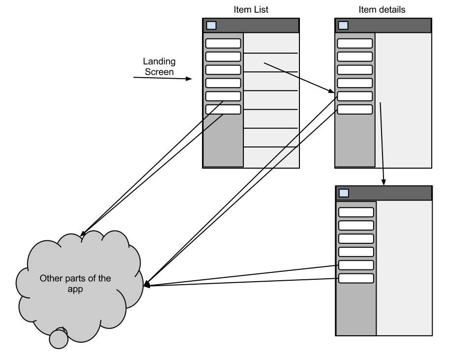
I'm happy to see that the new pattern guidelines adress this issue as well! The guidelines suggest that you enable the drawer navigation throughout your app and let users invoke it with a bezel swipe. For example Google Music already does this. You can use bezel swipe to quickly jump to any of the top level screens of the app.


Action bar is for actions, drawer navigation is for navigation
I think that the drawer navigation is a bit over used in apps nowadays. It is worth remembering that patterns should only be used if your app has the problem the patterns solves. Google introducing this as an official pattern does not mean that every app now has to use it! It is a navigation pattern that allows you to create a flatter navigation structure to your app. If your app only has one or two top level hierarchies using this pattern probably won't make your app better.Some apps try to add too much different things to their drawer navigation. It is not for actions. There's already a place for actions in your app and that's the action bar. Try to keep the drawer navigation for navigation!
Drawer navigation icon
On of my pet peeves in the old implementations of the drawer navigation has been the overloading of the up-indicator. This issue is addressed as well in the new guidelines. When the app icon (home button) is not an up navigation button but instead opens the drawer navigation the icon is replaced with the drawer navigation icon.

Improved discoverability
Discoverability is one of the weak points of this pattern. I believe that he change of the up indicator to drawer navigation indicator alone will help alot. But there's few other things Google recommends you to do when using this pattern.First time app launch
The guidelines mention that you could consider making the drawer navigation open by default when the user first launches the app. That should make the idea of the drawer being there more obvious.
Peek
Another idea in the guidelines is that when user taps and holds the left side of the app the drawer should open slightly to give the user a hint of its presence.
Drawer navigation checklist
The design guidelines list a handy checklist to see if your implementation matches the pattern definition. This list can also be found at the bottom of the drawer navigation guideline page.
- The action bar remains in place and adjusts its content.
- Your navigation drawer overlays the content.
- Any view represented in the drawer has a navigation drawer indicator in its action bar that allows the drawer to be opened by touching the app icon.
- You take advantage of the new visual drawer transition.
- Any view not represented in the drawer maintains the traditional Up indicator in its action bar.
- You stay in sync with the general navigation patterns for Up and Back.
Potential confusion
There is another pattern that have been used in Android apps although not very widely. It is the sliding pane layout. This is a responsive design pattern designed to help implement UIs that work well across the wide range of Android devices. In the sliding pane layout the structure is very similar to the drawer navigation but it's use is different. It's an alternative approach for implementing the common master/detail pattern. The Sliding Pane Layout is also available in the latest support library.
The potential user confusion can come from the similar interaction of these two patterns. If you implement both of them in the same app be careful and test the app on real users before publishing it. Also, take great care doing the visual cues correctly. In the drawer navigation the drawer slides on top of the content but in the sliding pane layout the lower level content overlaps the higher level content (this is very similar to activities appearing on top of previous activities).
Take a look at the Google IO presentation about the sliding pane layout to get a good overview of the differences. Here's a direct link to the relevant part of the presentation: http://youtu.be/Jl3-lzlzOJI?t=16m20s.
Implementing drawer navigation

Mark Allison has also started a series of post in his awesome Styling Android blog about implementing drawer navigation. At the time of writing this he has published the part one. This series is definitely going to be a great source about the implementation once completed.
No comments:
Post a Comment