
[UPDATE] Information in this post is outdated! Please read a new post about this topic instead: http://www.androiduipatterns.com/2013/05/the-new-navigation-drawer-pattern.html
 Android UI has been improving with a phenomenal speed in the last year (I composed a small gallery of some apps I really like in Google+). Many of the changes has been only cosmetic (holo theme, Roboto font, etc). We haven't seen large changes in the way user interfaces are designed beyond that. We might have one such change happening now though.
The facebook's side navigation was recently picked up by few apps nearly simultaneously. First we saw the Spotify redesign using it and shortly after the Evernote redesign. Not long after that the Google+ redesign also embraced the side navigation design pattern.
The implementation in each of the apps is very different. The navigation look and feel different but the underlying approach is the same. The idea is to provide users quick shortcuts to the most important part of the application without having to leave the screen they are on.
The visual differences of the implementations are very apparent. The Google+ app slides the navigation on top of the UI while the others move the UI to the side. Google+ also has the up caret icon and the action bar present when the menu is opened while other apps don't.
There was a interesting discussion about this pattern in the blog's Google+ page some time ago. You can find the post & discussion here: Google+.


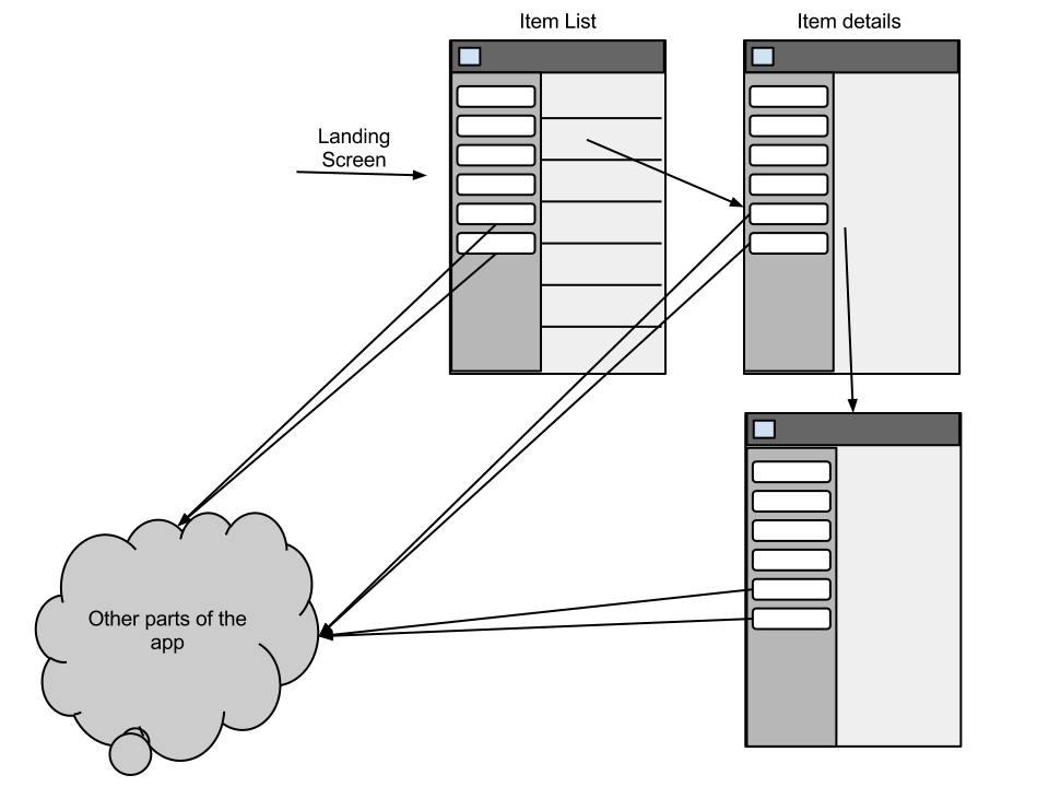
The Dashboard also requires users to come back to the app's home screen to navigate to other parts of the app. Here's a abstract wireframe of a generic Android app with a dahboard and one section of the app is a list of items and tapping any of the items takes the user to an item details screen (a very common mobile app structure). in this example the user first selects an item from the dasboard, then selects one of the list items and moves to another item from the first item.
This example demonstrates the difficulty of navigating between app sections in a dashboard app.
.png)
The new side navigation removes both of the problems. Users can directly access any major part of the app without having to move back up in the activity stack first. Therefore the app can launch directly yo one of the primary screens instead of to the dashboard providing users content directly.
The following example wireframe is the same app transformed to use the side navigation. Firstly, the app's landing screen has content visible and the user can access the other parts of the app directly from any screen.

I believe that the side navigation is superior to the old dashboard concept. There might still be use for the dashboard but use for it will be much more limited. In rare cases it might be impossible to select any of the app's screen as the landing screen. In those cases a dashboard might still be a good option. Aos, massively complex apps might make it easier for first time users to get hang of the app by presenting a non-intimidating dashboard instead of an overwhelming screen when they first start the app.
It might be time to say good bye to the pattern that was one of the identifying symbols of Android UI not so long ago.


more after the break..
In my opinion using the side navigation makes up obsolete and unnecessary. If your app is well structured and you provide an easy access to any of your app's main screen through the side navigation from any screen users are never more than few clicks away from any screen. The phone's back button still takes care of most of the navigation needs anyways.
If you look at the Google+ app and how the side navigation works you'll find out that you must first "up" your way back to one of the category home screens to be able to access the side navigation. I think that this defeats the purpose of it. If I'm, for example, reading one of my feed items and suddenly want to start a hangout why do I have to go back to the streams screen to be able to navigate to the hangouts?
Instead of an up button I would much rather see the top left home icon on the action bar opening the side navigation always no matter on which screen you're on.
If you decide to use the up anyways you should make sure not to use the up caret when the side navigation will be opened by the home icon. Using the same left arrow than up functionality uses breaks one very fundamental user interface design guideline: it should always be obvious what a button does on a UI. The up button (which is already not that clear) can suddenly have two very different functions and user cannot tell which one it is without trying the button.
I think we need another icon for the side navigation as part of the operating system that will bring consistency to this concept. Here's a very crude draft of what I mean. The first picture shows how the home button looks like when it is an up button (this is the current look). The second picture is a draft how it could look when the home button is used to open the side navigation. This would save users from confusion in apps that choose to use both up and side navigation.


Android navigation and Spotify (with friends)
Slide-out navigation done better
The side navigation is probably the most important component in any app that chooses to use it. Users won't be able to navigate in the app without knowing how to open it.
 After experimenting with all the apps I found using this pattern I feel that none of them have got it quite perfect. The closest one I feel is the Prixing app. This app has abandoned the concept of up and made the app's home button a dedicated button opening the side navigation.
This app also has added a gesture shortcut for accessing the menu. Users can perform a bezel swipe to open it. While bezel swipe can be a difficult gesture to find it isn't a problem in this case as any user can reach the same results by tapping the home button. (I wrote about bezel swipe some time ago. Here's the article.)
The only improvement I'd like to see in this app would be to still use the app icon as the home button maybe adding some additional icon showing that the button has this functionality.
Other apps are using different methods to open the side navigation. Evernote for example uses a swipe on the user interface. This causes some consistency problems as swipe is already reserved gesture for moving between tabs. As evernote is using tabs in some parts of its UI the side menu is not accessible via this gesture unless the user is on the leftmost tab.
My recommendation for opening the side navigation is to always open it from the home button (ditch up) and support bezel swipe as a shortcut for the same function. If you must use up in your app make sure that the icon is different when the up button turns into the side navigation button.
.png)
We might have to wait for Google to name this pattern before one of the names gets established. A democratic process is probably going to fail here. For now, I'll be calling it side navigation but I'm open to changing it once one name gets established.
android-fb-like-slideout-navigation at github
There's also a video demonstrating the library at work.
EDIT: Here's another library project:
https://github.com/darvds/RibbonMenu
Thanks Mr BuBBLs in comments!
Two more library project:
https://bitbucket.org/jfeinstein10/slidingmenu/overview
https://github.com/Gregadeaux/android-fly-in-app-navigation
If you know any other library projects doing this please leave a comment bellow or at the Google+ page!
Cyril Mottier has also written about implementing this pattern in his blog. These posts are very much worth reading:
The making of Prixing #1: Fly-in app menu
The making of Prixing #2: Swiping the fly-in app menu
The making of Prixing #3: Polishing the sliding app menu
See also the Prixing app on the Google Play to try out the side navigation implemented by Cyril.
The Google I|O is also just around the corner. We will likely see the next Android version getting announced in the event. I'm hoping that Google continues their push of getting these more complex components into the operating system (like they did with Action Bar in ICS / Honeycomb). I'm hoping that we'll see a side navigation component as part of the new release bringing consistency to the implementations.
 Android UI has been improving with a phenomenal speed in the last year (I composed a small gallery of some apps I really like in Google+). Many of the changes has been only cosmetic (holo theme, Roboto font, etc). We haven't seen large changes in the way user interfaces are designed beyond that. We might have one such change happening now though.
The facebook's side navigation was recently picked up by few apps nearly simultaneously. First we saw the Spotify redesign using it and shortly after the Evernote redesign. Not long after that the Google+ redesign also embraced the side navigation design pattern.
The implementation in each of the apps is very different. The navigation look and feel different but the underlying approach is the same. The idea is to provide users quick shortcuts to the most important part of the application without having to leave the screen they are on.
The visual differences of the implementations are very apparent. The Google+ app slides the navigation on top of the UI while the others move the UI to the side. Google+ also has the up caret icon and the action bar present when the menu is opened while other apps don't.
There was a interesting discussion about this pattern in the blog's Google+ page some time ago. You can find the post & discussion here: Google+.


Dashboard is dead(ish)
The side navigation replaces the much criticized dashboard pattern in the apps. The major criticism towards use of dashboards has been that it slows users down on their way to the app's content. Every time you launch the app you must first tap an icon to get where you want.The Dashboard also requires users to come back to the app's home screen to navigate to other parts of the app. Here's a abstract wireframe of a generic Android app with a dahboard and one section of the app is a list of items and tapping any of the items takes the user to an item details screen (a very common mobile app structure). in this example the user first selects an item from the dasboard, then selects one of the list items and moves to another item from the first item.
This example demonstrates the difficulty of navigating between app sections in a dashboard app.
.png)
The new side navigation removes both of the problems. Users can directly access any major part of the app without having to move back up in the activity stack first. Therefore the app can launch directly yo one of the primary screens instead of to the dashboard providing users content directly.
The following example wireframe is the same app transformed to use the side navigation. Firstly, the app's landing screen has content visible and the user can access the other parts of the app directly from any screen.
I believe that the side navigation is superior to the old dashboard concept. There might still be use for the dashboard but use for it will be much more limited. In rare cases it might be impossible to select any of the app's screen as the landing screen. In those cases a dashboard might still be a good option. Aos, massively complex apps might make it easier for first time users to get hang of the app by presenting a non-intimidating dashboard instead of an overwhelming screen when they first start the app.


more after the break..
Side navigation problems
Unfortunately, getting the side navigation right is much more difficult than getting a dashboard right due to the increased complexity.Up?
I've never been fan of the up concept in Android. I think it is impossible for users to differentiate between up and back. Google deciding to use an arrow pointing left to indicate up isn't helping that. Every user I've talked to refer to the top left button as the back button.In my opinion using the side navigation makes up obsolete and unnecessary. If your app is well structured and you provide an easy access to any of your app's main screen through the side navigation from any screen users are never more than few clicks away from any screen. The phone's back button still takes care of most of the navigation needs anyways.
If you look at the Google+ app and how the side navigation works you'll find out that you must first "up" your way back to one of the category home screens to be able to access the side navigation. I think that this defeats the purpose of it. If I'm, for example, reading one of my feed items and suddenly want to start a hangout why do I have to go back to the streams screen to be able to navigate to the hangouts?
Instead of an up button I would much rather see the top left home icon on the action bar opening the side navigation always no matter on which screen you're on.
If you decide to use the up anyways you should make sure not to use the up caret when the side navigation will be opened by the home icon. Using the same left arrow than up functionality uses breaks one very fundamental user interface design guideline: it should always be obvious what a button does on a UI. The up button (which is already not that clear) can suddenly have two very different functions and user cannot tell which one it is without trying the button.
I think we need another icon for the side navigation as part of the operating system that will bring consistency to this concept. Here's a very crude draft of what I mean. The first picture shows how the home button looks like when it is an up button (this is the current look). The second picture is a draft how it could look when the home button is used to open the side navigation. This would save users from confusion in apps that choose to use both up and side navigation.


Back stack problems
Managing back stack correctly is very important. The side navigation concept can make the back stack even more complex. Alexander Blom has written few good blog posts about this subject. I recommend you to check them out:Android navigation and Spotify (with friends)
Slide-out navigation done better
What opens the side navigation?
How should users be able to open the side navigation? What gestures and buttons should be used?The side navigation is probably the most important component in any app that chooses to use it. Users won't be able to navigate in the app without knowing how to open it.
 After experimenting with all the apps I found using this pattern I feel that none of them have got it quite perfect. The closest one I feel is the Prixing app. This app has abandoned the concept of up and made the app's home button a dedicated button opening the side navigation.
This app also has added a gesture shortcut for accessing the menu. Users can perform a bezel swipe to open it. While bezel swipe can be a difficult gesture to find it isn't a problem in this case as any user can reach the same results by tapping the home button. (I wrote about bezel swipe some time ago. Here's the article.)
The only improvement I'd like to see in this app would be to still use the app icon as the home button maybe adding some additional icon showing that the button has this functionality.
Other apps are using different methods to open the side navigation. Evernote for example uses a swipe on the user interface. This causes some consistency problems as swipe is already reserved gesture for moving between tabs. As evernote is using tabs in some parts of its UI the side menu is not accessible via this gesture unless the user is on the leftmost tab.
My recommendation for opening the side navigation is to always open it from the home button (ditch up) and support bezel swipe as a shortcut for the same function. If you must use up in your app make sure that the icon is different when the up button turns into the side navigation button.
Actions in side navigation
I've been talking about navigation but many of the implementations go beyond navigation. To me it makes sense. The action bar is the place for contextual actions for the screen the action bar is on. What if your app has some actions that are so important that they should be reachable from any screen?
Evernote has solved the problem by introducing actions in the side navigation. I think their implementation is great. It can be slightly overwhelming at the first use but the clear sectioning of actions and navigation is making it easy for the users to quickly to form a good mental model of the navigation and actions.
.png)
What to call it?
Naming patterns in a descriptive and consistent way is important. One of the benefits of patterns is that they can easily be used in discussions by simply referring them by their name. For established patterns no further descriptions are needed. "Maybe we should use action bar in the UI" or "How about quick actions in this list" are self explanatory sentences.
So what should this pattern be called? I've been referring to it as "side navigation" in this post but there are many, many more names for it.
- Side navigation
- Fly-in app menu
- Slide out navigation
- Sliding navigation bar
- Slide menu
- ...
We might have to wait for Google to name this pattern before one of the names gets established. A democratic process is probably going to fail here. For now, I'll be calling it side navigation but I'm open to changing it once one name gets established.
Technical implementation
The side navigation isn't (yet) included in the Android SDK. A quick search in github does reveal one project that has implemented the UI pattern.android-fb-like-slideout-navigation at github
There's also a video demonstrating the library at work.
EDIT: Here's another library project:
https://github.com/darvds/RibbonMenu
Thanks Mr BuBBLs in comments!
Two more library project:
https://bitbucket.org/jfeinstein10/slidingmenu/overview
https://github.com/Gregadeaux/android-fly-in-app-navigation
If you know any other library projects doing this please leave a comment bellow or at the Google+ page!
Cyril Mottier has also written about implementing this pattern in his blog. These posts are very much worth reading:
The making of Prixing #1: Fly-in app menu
The making of Prixing #2: Swiping the fly-in app menu
The making of Prixing #3: Polishing the sliding app menu
See also the Prixing app on the Google Play to try out the side navigation implemented by Cyril.
Future
I think this is a good step forwards in the Android UI design. We must be extremely careful not to create an unmanageable mess of different implementations that will look the same but function differently confusing the users.The Google I|O is also just around the corner. We will likely see the next Android version getting announced in the event. I'm hoping that Google continues their push of getting these more complex components into the operating system (like they did with Action Bar in ICS / Honeycomb). I'm hoping that we'll see a side navigation component as part of the new release bringing consistency to the implementations.
Summary
I'm a fan of the side navigation concept. It is, however, very easy to get it wrong. If you decide to include it in your app be aware of the potential problems. Design the back stack, gestures, relationship with up and visuals very carefully.
Very good post!
ReplyDeleteTry Euro 2012 official app https://play.google.com/store/apps/details?id=com.imano.euro2012.row&feature=search_result#?t=W251bGwsMSwxLDEsImNvbS5pbWFuby5ldXJvMjAxMi5yb3ciXQ..
They also use it!
Thanks Giacomo :)
DeleteI've tried the app. Unfortunately it is yet another cross-platform failure. This time it is a bit more Android leaning experience than iOS but anyways. I chose not to include it in this post due to the bad user experience of the app in general.
I posted some comments about that app into the Google+
https://plus.google.com/u/0/b/104844169030193199790/104844169030193199790/posts/3igyRZ6G2eV
Their implementation also is very different from the others,
I have to say, I'm not a fan of this pattern at all, because the s(l)ide menu is often poorly implemented. Prixing is the only app that makes it even pleasant to use it, with the attention to detail that you clearly see put in there.
ReplyDeleteUntil we get somebody that properly implements it in a library just like Jake Wharton did for the Action Bar with ActionBarSherlock, this is going to be a hell of a mess.
Yes, you're absolutely right. I see potential for great disaster in this pattern. Then again it is difficult to get it right before it is first experimented with. The Android way of getting UI right has been to have multiple different implementations out there from which the best features naturally rise to the top. I hope the process goes fast with this pattern. We already have pretty good understanding what works and what doesn't.
DeleteThat's true. I think we won't find this in the SDK classes anytime soon, thou. See how much time it took for the Action Bar to be "officialized": launched at I/O 2010 as in the Twitter client and officially implemented only in Honeycomb, in Q1 (or was it even Q2?) 2011.
DeleteJust like there are multiple Action Bar libraries, but very few of them actually make sense as much as ABS does, we need somebody as skilled ad Jake to make a reference implementation. I'd say we should go for as much as possible towards where Cyril Mottier went; unfortunately, he's not going to open source Prixing code (because he can't); it would benefit the whole Android dev community if he did, thou, because that's the only slide menu that actually _feels_ right when using it.
Re: what works and what not, I'd say Cyril is again right making the slide menu available from everywhere - at least in Prixing, where he has lots of same-level activities, making a dashboard even counter-productive.
In an app that has just a few top-level activities but that leads you deep in details, it might not make as much sense, IMO. Unless, of course, you throw the whole Up thing away and use the slide menu to provide quick access to other areas of the app. But then again, the backstack might mess your UX up.
Perhaps this pattern could make feasible to have apps with just one Activity and lots of fragments. Dunno, it might get too messy on the Activity code side.
The ABS standard was actually exactly what I set for myself when I decided to make my open source implementation of this UI pattern (listed above in the Technical Implementation section https://bitbucket.org/jfeinstein10/slidingmenu/overview). I've tried my best to bake everything in to the library at the Activity level. Currently, the developer has to call 2 functions in onCreate: setContentView, which sets the main view of the application, and setBehindContentView, which sets whatever view they want in the "menu tray". You can see an example of it here: http://www.youtube.com/watch?v=dfR9kR55E8I
DeleteThere's still a ways to go. For example, I don't yet have the drop shadow that Cyril talks about and that I think is crucial to giving a user the needed perspective, but it'll be implemented soon enough. I'll also be making my own menu styles that can be customized by each dev, but for now, I'm leaving that up to them and providing them with a blank canvas.
I don't like this pattern either. It reminds me of Apple's annoying side-shelves on windows. It's functionally equivalent to a menu or a pulldown (eg, like the notifications panel), but by pushing the display to the side instead of overlaying it it's jarring.
DeleteAlso, it makes you think that if you switch to portrait orientation then it'll become a sidebar, but that doesn't happen.
I think it would even be better to leave the dashboard as is, but don't make it the default entry screen. That would be functionally the same, but remove that jarring shift.
Alternatively, incorporate that shift into the UI, with a gesture, and make dragging to the right over the top of the screen bring in the sidebar, and dragging back again dismiss it.
I've been searching a bit and I found this library https://github.com/darvds/RibbonMenu. Thanks to this post here : http://stackoverflow.com/a/10872729/162178
ReplyDeleteBrilliant, thank you!
DeleteSorry for double posting, but I prefer this way of showing the menu (like in G+ App). I'm not a great fan of the menu "pushing" the entire app screen. Although, like seebrock3r said, the Prixing app menu is a very a polished version of this pattern.
DeleteThat is going to be an interesting factor. I haven't made up my mind yet which one I'd prefer. It all should come down to figuring out which of them will help users to understand the concept better.
DeleteTouristEye app also uses it, https://play.google.com/store/apps/details?id=com.touristeye
ReplyDeleteWe think we have done a great design too you should check out to get inspired ;)
Indeed great design. I'm just wondering why it lags so bad on my Galaxy Nexus
DeleteThe dashboard design pattern might still be useful on tablets in landscape mode where the screen estate is generous horizontally to accommodate a fragment on the side for the dashboard. I see the side navigation pattern most useful when screen estate is limited. In addition, side navigation is most likely not usable or awkward with d-pad navigation devices, e.g. TV.
ReplyDeleteHey Whui Mei Yeo,
DeleteAdapting this to tablets is an interesting design challenge. It might be that it naturally goes to a dashboard but I'm not sure.
TVs are definitely a fully different case in UI design. The action bar adaptation that Google advocates for Google TV is actually pretty close to this design pattern but not quite.
I think this will be the winner for one reason: it's compatible with the ActionBar.
DeleteAll of those who need to 'move' the screen can't easily be implemented with the stock actionbar (or ABS).
I prefer the other (I'm starting to like this pattern, and I hate you all :p), but that's my thought.
Maybe I'm wrong, we will see
IMO, ListNavigation solves this problem better than Side Navigation. At least where the side item is just a list. Evernote's side navigation made sense, but only because they made it more of a dashboard. G+ should have definitely gone with ListNavigation.
ReplyDeleteMy biggest gripes with Side Navigation are that it doesn't play nice with an ActionBar, and it is hell on maintaining your back stack. Tab and List Navigation are clear in that they are built into the ActionBar, and only work on the current level screen, so no stack changes are made. Evernote managed to somehow skirt the back stack issue (there's still some oddness and things don't feel quite right), but they essentially had to reimplement the ActionBar and it doesn't work quite right either. They end up in an uncanny valley where things are close to feeling native but clearly aren't. And this is the best case I've seen (Prixing solves a few of their issues, but I haven't had a chance to play with it myself).
I really hope they touch on this pattern at I/O and either provide guidance (and preferably libraries) on how to implement it properly, or show better alternatives.
I disagree that a Dashboard pattern needs to feel dated. Take a look at FriendCaster or PayPal for proof of that. Dashboard's biggest problem is scalability, and that's solved by bringing content into your dashboard. You can tease a small amount of featured content on smaller devices, and expand into a full featured area on larger devices. FriendCaster's approach also works moderately well (I'm not so sure about the dashboard-like pop-up, but the side list is nice with a few tweaks)
Hey Keyboardr,
DeleteThank you for this very well thought out argument!
I'm pretty sure we'll see something about this in the IO. There's a special session about navigation & G+ just implemented this pattern so it would make sense for them to talk about it.
I think the G+ issue is more about the way they implemented it. I don't like the mixture of up and side nav they use.
You're also absolutely right about dashboard not having to disappear. I do think that it isn't as good solution to the same problem as the side navigation (or list navigation is some apps) meaning that its use should be considered more carefully.
It funny that nobody mentioned that this concept originated in webOS in the for of floating panes.
ReplyDeleteIronically, Mobile Firefox/Fennec had a side/swipe navigation several years ago, but they recently abandoned it.
ReplyDeleteI know it's not quite the same as a navigation pane, but Dolphin HD Browser has used a side-swipe-accessible bookmark list for ages, and is one of the main reasons I love it. It's a great way to avoid having a dedicated screen for intermittent use things (bookmarks and navigation pane menu items being good examples).
ReplyDeleteYeah, what about Dolphin?!? What an incredible browser. Hard to beat on android.
DeleteHi all,
ReplyDeleteHere's a cool implementation of this UI pattern that I've been working on:
https://bitbucket.org/jfeinstein10/slidingmenu/overview
I've embedded this sort of layout at the Activity level, so you have to make 2 different calls in your Activity's onCreate method: setContentView and setBehindContentView.
It's open-source so long as you include the license (to be posted) and site me :)
Excellent, thank you for sharing!
DeleteNo problem! I thought this UI pattern was super cool and something that everybody should have access to, so I threw this together pretty quickly and will continue to work on it. The next step for me is making it known to everybody. Perhaps you could include in the Technical Implementation section? Thanks :)
DeleteI'll also be making a demo video, and I'll post the link here soon.
DeleteHere's that link:
Deletehttp://www.youtube.com/watch?v=dfR9kR55E8I
Thanks for the interesting post :)
ReplyDeleteI actually realized a similar thing quite recently when i had to decide if i can use Necessitas for an Android app and still make the UI feel consistent.
Hi,
ReplyDelete1996 called and they want their Palm OS top pulldown menu back.
Thanks!
I didn't realize this pattern started on Android, I first saw it on Path on iOS. Either way, this Teehan & Lax article does a nice job deconstructing this type of menu, particulariy the gesture and interaction design for revealing the menu:
ReplyDeletehttp://www.teehanlax.com/blog/going-down-the-right-path/
Can we stop giving facebook credit for everything. "side navigation" existed before facebook co-opted it for its own app.
ReplyDeleteCan people please start coming to their senses about facebook, please. They haven't had an original idea since Zuckerberg first stole his "idea" from others. I know it's hard for my fellow Americans, but please remember that "success" does not directly correlate with deserving it.
Great article. Adding a swipe gesture to access the side navigation makes it even more intuitive.
ReplyDeleteIs this a totally new pattern, isn't it just a variation of the good-old menu-bar (a'la Nokia S40, Symbian, Android standard Menu)? With more dynamic content, and the menu being opened from top-left?
ReplyDeleteEspecially this screenshot looks very much like any menu:
http://3.bp.blogspot.com/-xE7xi9ztklo/T9PKots9aMI/AAAAAAAAHfk/CzUcd_iKt3Q/s1600/5.png
So ICS killed the menu, and now it's reimplemented as side navigation?
Great article! At AppBrain we are tracking the usage of Android libraries, we will add these new side pattern libraries to see if their usage will grow in the future:
ReplyDeletehttp://www.appbrain.com/stats/libraries/dev
Is there a way how to add this side-nav button to the action bar (Android 3.0), or do I have to make my own action bar?
ReplyDeleteYou can definitely remove the title and logo in the ActionBar and then enable adding custom views to add a button that toggles the sliding menu open. I would search stack overflow for more details on this.
DeletePersonally, i think at least for the existing libraries that I've seen, it would be easier to maintain your own simple ActionBar implementation. Doing this would allow you to physically move the "ActionBar" like the ones in the Spotify, Facebook, and Prixing apps when sliding. The Google+ app has a good example with the native ActionBar and IMHO the sliding animation isn't as slick or intuitive.
For things like inflating a settings menu, I would probably subclass Fragment adding a method for creating a menu and then attach it to my faux Action bars right button when the Fragment is set as the main view. Hope that answers your question!
Great info. Thanks for this impressive sharing. The Dashboard also requires users to come back to the app's home screen to navigate to other parts of the app.
ReplyDeleteDashboard pattern have also one important advantage over side navigation: it presents user with major spectrum of application functionality that wouldn't be discovered by average user otherwise.
ReplyDeleteLooks like Windows Phone UI
ReplyDeletehttp://www.engadget.com/photos/windows-phone-7-series-interface/
Excellent article, thanks. I'm also anticipating something about this at I/O
ReplyDeleteThe Steam app from Valve also had side navigation. I really like it and hope this catches on.
ReplyDeleteSide-Navigation is a nice pattern because more than being intuitive when being correctly done like in Prixing app, it's fun to use !
ReplyDeleteAnd having fun when using an app, makes it more used !
The most important part in this pattern is the back-stack. Indeed, when the side-navigation is displayed on every screen (one of the pros of this pattern), the user should be able to navigate between sections of the app, and the app should keep stack of each section in memory to allow the user to rapidly switch between sections (for example, switching between a product's detail screen and a cart in a m-commerce application). Thereby coming closer to the UITabBar in iOS.
And this is the real challenge of the implementation of this pattern given the complexity of the activity/fragment stack management !
If anyone has an idea on how to solve this problem...
I am still not convinced. The back stack issue is HUGE. You effective litter the back stack with garbage in any app complex enough to warrant a side menu. I know why this pattern is great on iOS (no true management of back stack!), but there has to be a better solution for global access to high level actions on Android.
ReplyDeleteBezel Swipe / Swipe gesture is also troubling when ViewPager is pushed and implemented so widely. Overloading is a bad idea when it comes to user interaction. ViewPager is not going anywhere and this just creates confusion.
Considering all this, Google+ does it best. They should indicate if its truly up or a menu (which technically IS up - hierarchically the side menu is your home base, dashboard, etc) but user perception is up is actually back.
So now we are in a design pickle as you cannot implement side menu as is with Android patterns as they are. Most designers would say these are just pattern suggestions but thats like running before crawling. We just got concise guidelines in ICS and all of a sudden everyone is trying to skirt them.
Hi Juhani,
ReplyDeleteThanks for writing this up. After reading your article, I also went ahead and did some more researchs on this UI pattern and wrote something about it. I mentioned some of your idea in the post! :)
http://androiduiux.wordpress.com/2012/06/15/side-navigation-ui-pattern-in-android/
Hey so I'd like to throw my ring into the hat here with a library you can use. I'm calling this pattern the Fly-In App Navigation or FAN for short.
ReplyDeletehttps://github.com/Gregadeaux/android-fly-in-app-navigation
In it, you define two different layouts like you normally would; one being the main UI, one being the Fan UI. Then you just call setViews specifying the id's of the two views. There is another method (showMenu)that you can use to trigger the opening and closing of the menu.
This implementation allows the developer complete freedom with how it looks and acts. With this, you aren't restricted to a list view and you can do a dashboard inside like Evernote or a tabbed view like Dolphin. There is a sample application inside the library you can run.
As of now, the library is unfinished. Everything displays properly and the actions trigger, but there is only a closing animation, not an opening one. And right now the menu is restricted to a size of 200dip. But I hope to get it finished this coming week.
All animations work now.
DeleteThanks) Great work!
DeleteWhich implementation is best?
ReplyDeleteHi,
ReplyDeleteI just try to discuss about that hot topic on a french forum and I searches for a dashbord exemple on the Android Design site :
http://developer.android.com/design/patterns/index.html
Was the dashboard page removed from this site ? Parhaps I'm crazy but I remenber something like that other there. Is someone else remember it too ?
Hi,
ReplyDeleteI just try to discuss about that hot topic on a french forum and I searches for a dashbord exemple on the Android Design site :
http://developer.android.com/design/patterns/index.html
Was the dashboard page removed from this site ? Parhaps I'm crazy but I remenber something like that other there. Is someone else remember it too ?
Sorry for the double post, I can't edit it.
DeleteCheck this project: https://github.com/johnkil/SideNavigation
ReplyDeleteThink it should also make it's way into Web apps. It's much more cleaner this way and yes.
ReplyDeleteAbout the name, it's only a matter of time before one sticks :)
Excellent article. Seems like few in the Android world actually understand the user experience...and though we may disagree on a few points, your piece seems to support my issue with the removal of the physical buttons and the removal of the "Menu" button from the UI.
ReplyDeleteAs a user, I always knew that if a menu or settings existed in an app, all I had to do was hit the "menu" button...if it exists, the menu button will bring it up, plus it was in a convenient place. The move towards a software menu button will only complicate things for average user as we've seen, there is very little consistent in the Android platform.
1. Developers won't use it consistently and it will end up all over the device. Google has never been good about holding apps accountable to design specs.
2. The small icon and inconsistent placement mean that it is hard to locate, unlike the simple button at the bottom of the phone...which was easy.
3. The new action bar takes up screen space...even if it "disappears".
4. The "official" placement is NOT convenient for tablet users, or people that are used to working with one hand. Take the time to watch how 7-10 inch tablet users hold their devices...landscape with BOTH hands. Having the buttons (any buttons) in the center, or at the top of the screen means you have to readjust. This is also true with the larger phones...the upper right corner is difficult to reach, depending on how you hold your device.
5. Some have suggested that losing the physical buttons for the activity bar makes the phone more attractive...but really, who cares? I want a phone that is easy to use, not pretty
6. Yes, manufacturers were not consistent in the placement of the buttons from phone to phone (at least you had a button and always knew where to find it). Google certainly didn't object, so what makes us think that they will enforce any consistency with menu button or activity bar use in apps?
Consumers keep saying over and over (through surveys, forums, etc) that they NEED consistency they can count on (between all apps and functions).. for it to be SIMPLE and to work and be functional right out of the box. #1 stated reasons people abandon Android for iPhones. "easier to use", " I don't have to manage my phone", everything works the same way, I can find what I need".
Interesting to note...Hardcore Android fans are quick to dismiss Microsoft and Windows 7 or 8, but user ergonomics (how you hold a device, what is easiest and most comfortable, what is the most consistent) is precisely what they have studied and are developing W8 for. People (especially the hard core Android fans) are quick to ignore Microsoft's smartphone, but I was AMAZED at how easy and simple it was to use, and W8 looks to be even better. I can't wait!
To my mind...Google and Android are constantly handicapping themselves and their products, moving from idea to idea, never finishing or perfecting a good idea, and of course, always trying to keep you tied into the rest of their products.
Thanks for reading. I went "off topic" a bit, but it felt good to get all this out :-) I'm sure many disagree but that's what makes life interesting. Peace and health to all.
>3. The new action bar takes up screen space...even if it "disappears".
DeleteA very small point, but iOS applications use the design pattern of UITabBarController heavily. That's probably why the 'new' ActionBar was implemented.
Windows 8 easy to use!!! Users don't know whether something is click able or not.
DeleteHi, take a look at very minimalistic approach to side navigation - I call it Drawer - https://bitbucket.org/verdigo/drawer
ReplyDeleteHi, there also is LibSlideMenu, which we have featured with a blog post here: http://www.coboltforge.com/2012/07/tech-stuff-a-sliding-menu-for-android-very-much-like-the-google-and-facebook-apps-have-it/
ReplyDeleteIs it possible to do so with CSS3 HTML and javascript (mobile Jquery)??
ReplyDeleteAwesome Explanation, I was thinking of implementing this feature for my future android app :)
ReplyDeleteGreat article! Btw: Google itself refers to it as a drawer:
ReplyDeleteA drawer is a slide-out menu that allows users to switch between views of your app. It can be opened by touching the action bar's app icon (decorated with the Up caret.)
Source:
http://developer.android.com/design/patterns/actionbar.html