
Android market app quality is definitely on the rise despite of couple of disasters. I wanted to take a quick look at two new apps that I'm happy to welcome to the Android Market.
Vimeo


airbnb
Market link
This app design is much more direct port of an existing design than the Vimeo app. But it's not bad. They have taken the time to adapt to Android platform (other than the bottom tabs). The app looks and feels very nice.


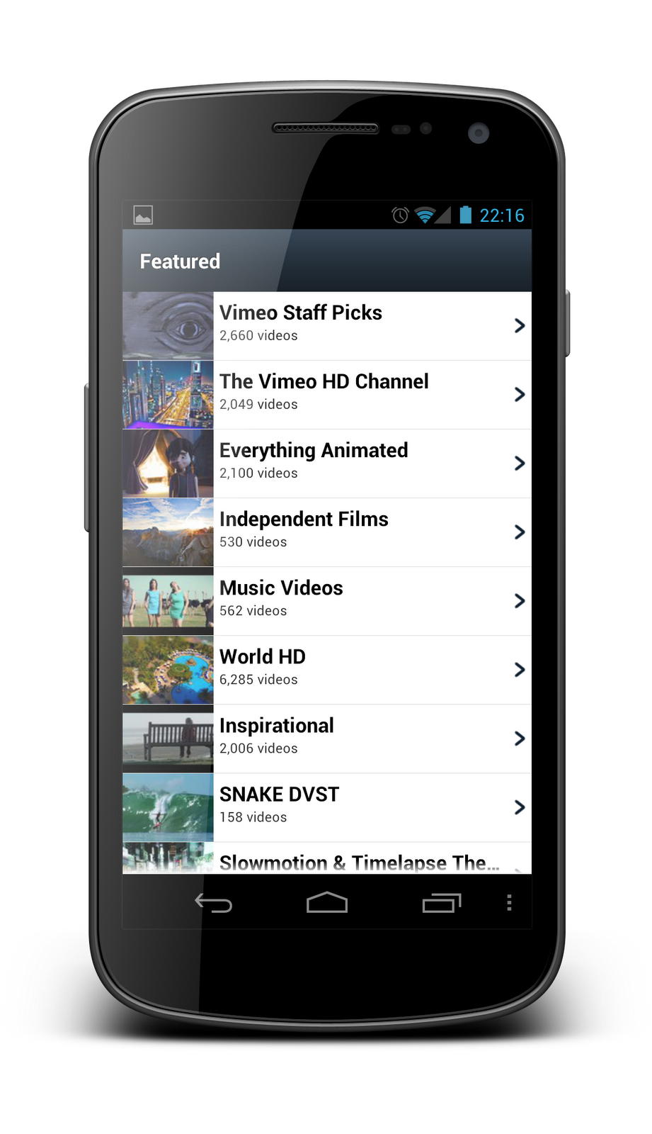
Vimeo
Vimeo's new app is visually very pleasing. While the visual style could easily fit to iOS it is not actually a copy of their existing design but a new one. There is no doubt that the designers behind this app are very familiar with iOS and likely not yet experienced with Android look and feel.
The app has few problems though. Firstly, maybe most notably, it doesn't support landscape mode on any other screen than on video playback (which in turn doesn't support portrait). I have no doubt that this will be fixed soon.
All in all this app looks and feels very nice. Good job Vimeo.


airbnb
Market link
This app design is much more direct port of an existing design than the Vimeo app. But it's not bad. They have taken the time to adapt to Android platform (other than the bottom tabs). The app looks and feels very nice.


I don't understand why app creators insist on adding iOS UI aspects such as the carat image on ListView items, directly against the Android UI guidelines.
ReplyDeleteI really don't like Android apps with bottom tabs.. It's beautiful, sure, but it doesn't feel like an android app.
ReplyDeleteI think it is perfectly excusable here as the guidelines weren't out before the app was released. And I'd say that the carat guideline is one of the points that definitely weren't clear before the guideline release.
ReplyDeleteAngelo, yeah. I'd definitely urge them to make a change to their design in their next update and move the tabs up.
ReplyDeleteI disagree with the tabs on bottom. Just because iOS has them on bottom, doesn't mean we should have them on top just to be different. The reason there are tabs on the bottom is because it's easier to reach with your finger without having to adjust your hand. I don't see why we have to do something ergonomically incorrect just to follow Android's design guide.
ReplyDeleteThis comment has been removed by the author.
DeleteI think that Android official recommendation to place tabs at the top is due to the fact, that near every Android device has several physical buttons (menu, search, home, back). So, keeping tabs at the top helps to avoid accidentally click on those buttons.
DeleteSeveral "virtual" buttons.
DeleteThey are cool before you start to click them by mistake, then they become much less cool.
We should probably also move the virtual keyboard on top.
What make iOS more ergonomical, when they have tab and the bottom and back button on top? You still need to adjust your hand.
DeleteTabs on the top prove difficult when dealing with search results views. An action bar with contextual information about the results (Pizza near Palo Alto) with a set of tabs between that information and the results effectively separates two related pieces of data. We are designing our app with bottom tabs for this reason alone. Any other good reasons? Good discussion :)
ReplyDeleteHello, 2 points
ReplyDelete1-
@Juhani Lehtimäki
by carat image are you referring to the arrow at the right end of the list?
2-
i think its fine for some apps (the vimeo app) not to support lanscape in all screens, on video makes sense but on list view wouldnt be useful. (its not a problem, its a UX decision)
thanks
Tabs always seem to spark a discussion. There are good arguments for both choices. I still recommend top tabs unless there's a good reason to break the rule. All tabbed UIs should always support swiping between tabs and not require users to tap the tabs to move between them. There are few acceptable reasons not to support swiping but it should be the default approach. Swiping is better and more satisfying method of navigating. Location of tabs doesn't matter when they are mostly used to indicate users current tab.
ReplyDeleteTop tabs also scale better for multiple screen sizes. When approaching tablet screen size top tab is more natural choice. Tabs on top is very familiar look for users from desktop, web and other OSes.
Also, platform consistency is a factor. Tabs on bottom always makes the app feel wrong on Android.
@ExperiencePlay
1) yes
2) It is a UX decision to destroy UX on many devices. There are many phones with slide out keyboards (for example moto droid series). On those devices the primary input mode is landscape. Other large use case is landscape docks. This is especially critical with a video app. This app simply cannot be used when the phone is on a landscape desktop dock. And the third device group that will be affected is tablets. Tabs are often used as landscape by default. Taking these into account I think it is a problem. All Android apps should always support landscape.
@Juhani Lehtimäki
ReplyDeleteim not sure all android apps should, i think content drives the navigation/orientation.its true about the sliding keyboard phones and this also affects accessibility. as some people rely on the keyboard to navigate, therefore they need both orientations.
Its a content and demographic consideration, do what is easier for the user and best to experience that app. you cant make everyone happy.
and with the tablets, well you will need another version perhaps with some adds on and with support for landscape and portrait (because of the size)
Interesting view, cheers