
Android platform doesn't have strong guidelines for how the apps should look and function. Google had made it clear from the beginning that they have no plans to start dictating what is acceptable and what isn't. There is a set of UI guidelines but they mostly concentrate on small things like icons, widgets and menus.
From the beginning of the platform there's been hundreds of different ideas of app UIs and the app look and feel has been far from unified. Now, as the platform has matured and number of apps has exploded a convergence of Android UI is emerging. Certain UI features has became a common place and some of them have even found their way into the Android SDK libraries. Soon, users will be expecting apps to work in more unified way. Certain controls and interaction models will be an integrate part of the Android experience.
In this article I want to summarise how Android UIs generally function on a higher level. I've written about many of the UI patterns before but they've been disconnected from the grand sceme of things. Now, I want to bring them together to illustrate what I think is how Android apps should look like.
Ice Cream Sandwich
Latest Android version (4.0) was released fairly recently. The release brought with it the largest set of user experience improvements the platform has seen in its life time. These changes naturally affect how Android apps will look in the future. Some of the improvements can be back ported to older versions but not all of them. In this article I mainly talk about how Android apps look right now. We will see the ICS UI evolution hopefully soon but the fact is that we have nearly 200.000.000 Android devices out in the wild running versions from 2.1 to 2.3.
App Landing Screen
The dashboard UI patterns is used by many applications. If your app has more than one main function this could be very good starting point. A dashboard shows off the most important function of the app and provide easy shortcuts to them.

A dashboard is very familiar for Android users. It is a certain way to make any user feel like home in your app's first screen if it is used correctly.


General Application Screen
The actual activity screens come in many forms but few features have became very common and users learned to understand and expect them. An action bar on top of a screen is very common and easy to grasp concept.
- Top left corner features an app icon or a home icon. Tapping should take the user to the app's front page. It is worth noting that newer action bars don't bring users to the front page but instead one level up in screen hierarchy.
- Middle of the action bar will feature title of the screen and either app's brand color or a color of the current section in the app.
- Top right of the screen will have icons for the most important actions that can be performed on this screen. In this part of the screen there should only be actions that are related to the screen content. A search function seem to have became a common exception to this rule though.


Check out Jake Wharton's ActionBarSherlock library project for help in Action Bar implementation.
List Screen
Lists are one of the most common components of Android UIs. It is also very useful in displaying data, especially if it is not known how much data there will be.
Lists have downside though. Each list item should be relative small to allow good overview of list content. But on the other hand jamming a lot information into a small area can make the it very difficult to users to use the list and see the items they want to interact with.
It is good to have some guideline how lists on Android work in general. Users have got used to certain elements and functions and if your list follows a similar approach your users have much easier learning curve.
Action Bar on List Screens
List screens can use action bar to display actions that are targeted to the whole list. Note that action bar actions on list screens should not be the ones that users perform on single (or multiple but not all) list items.
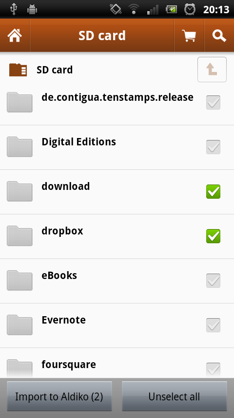
List Items & Checkboxes
List items themselves usually have bunch of text and few graphical elements. It is very common to have a checkbox on each item that can be used to select one or more list items to perform operations on them.
Placing the checkbox as the list items' leftmost item has following benefits:
- We are very used seeing checkboxes on left side of items we select. This is true in web, desktop UIs and elsewhere in mobile.
- Having the checkbox on edge of an item allows us to build a larger hit area for the checkbox which in turn makes it easier for users to differentiate between tapping a list item and selecting one.
- A graphical component on the left side of an item creates an easy visual clue for where one item ends and another one starts thus making it much easier for users to quickly scan the list.
Secondary Item Control
Some items need more interaction possibilities than simply selecting (the checkbox) or navigating (tapping). The most common use case for this control is starring or bookmarking row items. The only natural place for the secondary control is the rightmost edge of the item. Any other place would result in problems with hit areas.

Aldiko and Google Mail are good examples of apps utilising the lists nicely. Aldiko has chosen to put the checkboxes on the right as they have a visually dominating folder icon and placing a checkbox next to it would probably make the UI feel unbalanced.


Never Ending List
Many lists contain items that are loaded over a network connection. In that situation the loading process can take time and the list cannot be populated as fast as user scrolls it. In the case that user reaches to the end of a list the app should automatically start fetching more items. An indicator telling user that more items are being loaded is placed at the end of the list. Including some kind of loading animation, for example a progress indicator, is a good idea. Users associate animations with ongoing tasks.

The Android Market and Twitter both automatically load more items whenever an end of the list is reached.


Single Row Actions - Long Press - Quick Actions
Offering users a way to perform operations on a single row item without having to navigate into the item screen first.
As phones and tablets don't have right mouse buttons (they don't really have left ones either) a touch screen specific "right click" has evolved. By long pressing an item users indicate that they want to perform an operation on that specific item.
There is a UI pattern called quick actions for displaying actions for the list item. Use of the original graphical approach has pretty much died out but the concept is still the same. It is a form of an overlay menu that displays a very simple list of actions. Usually only three to five. Regardless of how the quick actions are visually implemented there are few important points to keep in mind:
- Don't cover the selected item! Especially when deleting users are much more confident in their actions if they see the target item all the time.
- Only show simple actions. Anything that requires a lot of interaction is better handled in a single item screen than in quick actions.

Aldiko, Asto File Manager and Google+ all use different visual styles in their quick actions. In all cases these actions are brought up by long pressing an item on screen.
Aldiko and Astro are examples of good design but Google+ is breaking the rule about hiding the target item as they use a simple popup. I hope they will fix this usability flaw in future releases.


Multi-item Actions
If the list has the checkbox control I taked about above it enables users to select multiple items. By selecting multiple items user is indicating that they want to perform an action to all the selected items.
A common way to handle actions to multiple items is to add a UI panel to the bottom of the screen offering buttons for available actions once user checks a checkbox. A nice sliding animations adds smoothness and feel of polish to the UI. The panel should automatically disappear when the last selection is checked or the action is performed.

Aldiko and GMail are doing good job in the multi-item actions. Both of the apps play a nice sliding animation when the bottom panel appears. Aldiko also adds a number in the import button telling the user how many items they have selected. That is a very nice addition but doesn't work in all cases.

More Info About Lists
For much more information about technical details about lists check out these two excellent article series:
And AndroidDevBlog's Cyril Mottier:
ListView Tips & Tricks #1: Handle emptiness
ListView Tips & Tricks #3: Create fancy ListViews
ViewPager – Part 3
ListView Tips & Tricks #4: Add several clickable areas


ViewPager – Part 2
Tabs
Many apps use tabs in one form or another to help users to navigate between pages. Android versions Honeycomb (3.0) and Ice Cream Sandwich (4.0) changed the way tabs work and look quite a bit. My opinion is that this change is something we should try bring into all of our apps regardless on which version they are ment to run on.
I wrote about the ICS recently in this post so I'm not going to repeat the content here. In short, what has changed is the new way to navigate between tabs. Users will expect that if your app has tabs they can navigate between them by swiping.

The Android Market and Google+ are good examples of apps that use swiping gestures to navigate between tabs.


Mark Allison has written excellent articles about technical implementation this topic too:
ViewPager – Part 1Check out Jake Wharton's library project for help in implementation:
ViewPagerIndicator at GitHub
Conclusion
Android is quickly maturing into a solid and more consistent platform. Apps are starting to get a consistent look and feel across the board and users are starting to expect certain interaction to be available in UIs. While there are no official guidelines available a deeper look at the more prominent apps give us a good understanding what we should be doing.
This is the best article i have ever found for the designing android app with awesome look.
ReplyDeleteAnd i am also following this dashboard design for all my android apps.
And yes, you have been added in "Blogroll" at my blog: http://www.technotalkative.com/
Thanx man,
keep writing.
Thank you :)
ReplyDeleteA really complete and great article for the UI design of an Android app!
ReplyDeleteGreat job Juhani and keep up!
Really great article!
ReplyDeleteGreat article. Thanx!
ReplyDeleteGood article !Thank you !!!
ReplyDeleteThe Google Music app is a better example for tabs, because you can use tapping and swiping to navigate.
ReplyDeleteAre 3 functions really enough for a Dashboard? I got an app with two main screens and the settings screen. Currently the app starts at one of those two screens and you can go the other and settings using the menu. I don't like this way and a dashboard would be a great solution, but doesn't it look a bit empty this way?
Hi, nice post!
ReplyDeletebtw, Aldiko has changed the UI a bit in the Premium version, now with Recent Reads section, you can see the screenshot here https://lh4.ggpht.com/bByLw5cZHAkduwoN-y8HL2VDGbKoNhCl30pORMyKBKRpDfHObdDf4ZJxjx3LXUPDdRM
great article! I'll share this with my co-workers at Motorola Mobility and with our developer community, MOTODEV.
ReplyDeleteThanks, it's nice information.
ReplyDeletePutting an left pointed arrow next to the application icon(top left) seems to take back to the previous page instead of go to the landing screen. Is the arrow necessary?
@miyuki
ReplyDeleteLook at this two links
http://developer.android.com/guide/topics/ui/actionbar.html#Up
https://plus.google.com/u/0/115177579026138386092/posts/boG4WGSwxoi(comment by nick)
Thank you for you thorough article.
ReplyDeleteYou nicely summed up the common features of the applications with the best user interface.
I'll definitely use your advices when I'll create my next application.
Well done on research, graphics and writing style!
ReplyDeletethank you.
I'd love to see more heavy integration of the "drag down to refresh" feature that's been making its rounds through Facebook and Twitter, recently. I love not hitting the "refresh" button and just dragging the list down from the top. It feels more natural, and it offers an instant confirmation that the list is now refreshing!
ReplyDeleteI must be the only one but I hate dahsboards...
ReplyDeleteMaybe 1 year from now it will go the way of the carousel (so trendy in 2009-2010 and so lame): it will look obsolete.
Other than that, great article.
No, you're not the only one who hates the dashboard. I think it is a very worthwhile discussion to have. I've seen dashboard used wrongly ie. in apps where there is a clear main function that should be opened instead of the dashboard or in apps where there simply are not enough functions to justify its use. Then again I've seen some apps which could have saved by use of dashboard instead of a overwhelming landing screen. It's a fine line and design patterns should never be used unless there's a clear need for them ie. the problem the pattern solves exists.
ReplyDeleteI am looking for tips on Android UI for data entry applications (insert,edit,delete and select data) and this article helps me a lot. Thanks
ReplyDeleteA very good article, many android developers out there should read this.
ReplyDeleteClear concise ideas, well written.
ReplyDeleteAnd VERY helpful.
Thanks!
Just awesome...!!
ReplyDeleteExcellent article. Very useful to android developer community.
ReplyDeleteKudos.
Well-written, honest and objective.
ReplyDeleteThank you for yet another good article. I really like how you take real apps and find good or bad points at them.
I will be glad to read more articles from you.
My app relies heavily on long clicks, but I wonder if novice users know to try long clicks.
ReplyDeleteI'm tempted to display hints that direct the user to try long clicks. Are there UI style guides for proving hints?
Eric Bergman-Terrell
www.EricBT.com/Vault3
Great job.
ReplyDeleteAbid Mahmood
Another amazing article by Android UI Patterns, congrats Juhani!
ReplyDeleteNice Article!
ReplyDeleteThis is the best Android UI guide , Seriously thx!!
ReplyDeleteGreat~ I like! Thanks a lot!
ReplyDeleteAll the new technologies have some advantages with disadvantages.No doubt it is launched with some limitation but after that it fulfill this limitation in next versions.So according to me that's good point of each new technologies.
ReplyDeleteWhich tool is used to run your project.i download your demo project but i use eclipse for develop my college internship project.plz tell me how i run that demo project on eclipse
ReplyDeleteGreat,thank you!
ReplyDelete