
It thought I'd write a follow up to my previous post about Android back button to clarify my stand on it and explain my point of view a little better. Also, I want to thank anyone who contributed thoughts to the discussion in the previous post. I find it the discussion very fruitful.
Firstly, I'm not against the back button. I don't think back button should be removed. I think it makes navigation on the phone much easier than how things would be without it. I believe that user experience even with the current, in my opinion flawed, approach is much better than for example iOS single button approach.
While I'm not the only one who has written about this the other posts I've seen against back button behavior have been somewhat biased and therefore haven't managed to start a discussion about the topic but have sparked an argument instead. Even my precious post have been posted to twitter saying that from what I wrote somehow follows: "Android UX fail" or "Android UX is Shit".
That said, I still think it could be improved and I think it is currently flawed. What I want is a discussion about the back button. Hence this post. This post is meant to continue the discussion from the comments in the previous post.
Mental Model
But first, I want to clarify what I mean when I talk about mental models because I think mental model theory is the core behind my argument. I know this is probably very familiar to most of the people reading this blog but I still want to take a second to talk about them.
While the mental model theory can be taken pretty far but in this topic it can be simplified a bit for us to be able to reflect about Android's back button and related issues. On the very basic level a mental model is a model in in users' head simulating the app's functionality. I think the easiest analog is the way we think about car steering. When we drive a car we're able to steer using the steering wheel because we have a model of understanding how it works. We think that the steering wheel is connected to the front wheels and turning the steering wheel turns them.
While in fact our mental model in the car example is not true (in modern cars the steering wheel is not physically connected to the front wheels at all) it doesn't matter. Because our mental model corresponds exactly how the steering function in real world steering a car is very easy for us. We don't even have to think about it.
The same applies to everything else we do including any softwarere use. We, as users, build a working model into our head telling us how the app functions. We are able to simulate the functionality and predict how the app will respond to our input. Whenever we're unable to predict the app's functionality or the actions don't match our expectations we feel that the app isn't behaving like it should. This is how usability problems manifest themselves. Simply mismatch between real world and our expectations based our internal simulation, the mental model.
We form our mental models the same way as we learn as kids. The real world works consistently. When we throw a ball it always follows the stame trajectory and we form a model we can apply to throwing other things without having to understand how gravity really works. It is consistency that makes learning easy for us.
Difference Between Implementation Model and Mental Model
As a respond to Christoffer Du Rietz's article about Android buttons Tim Bray and Steven Van Bael have written very good articles about the same topic talking about the back button functionality. To me both of these responds demonstrate a problem. While they are factually correct I think they talk about a little bit different thing that what my point in this issue is. They both explain how the button works very consistently technically. To me that isn't important. What is important is that it looks and feels to consistent to users.
Beware of Anecdotal Evaluation
Whenever reading about usability problem the normal reaction is to think if this applies to me. I do it all the time and I keep hearing it over and over again on blogs and at my work. Unless you're writing an app for Android developers it is very unlikely that you think about apps same way as your users do. Be aware of difference between you and your users.
Always remember:
Browser vs. Operation System
As Mark Murphy pointed out in the comments back button is very familiar to us from browsers. Although it is possible to find technically similar cases in the browser world for most of the cases I've listed they are conceptually very different from user's point of view. Browser back never interferes with keyboard or exit the browser. Also, a browser uses fairly clear pages metaphor where back fits very well.
An OS has much more interactions than a browser and an OS is pervasive and must support all apps. A small flaw in an OS will spread through the whole system.
Solution
In ICS release Google fixed one button related UX problem in Android. The menu button. The problem was that as the menu button was a hardware button there was no way to indicate if there's menu options available on any screen. For users only way to figure out if the menu button is active was to press it and see if a menu appeared. The fix came in form of on-screen buttons. Menu button simply isn't visible when there's no menu available. Brilliant, job well done.
On Honeycomb when the on-screen keyboard is open back button icon changes. This small change makes it very clear that it no-longer will take user to the previous page but dismisses the keyboard instead. On ICS it doesn't change anymore.
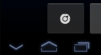

In my opinion this line of change could be taken further. Could the on-screen back button have more visual indication of its function? Would it be better if users could associate certain icon to certain functionality.
I still think that back button should never take user out from the app. In ICS it should get disabled or hidden when it would take user back to the launcher or home screen. Then again when the app is launched from an intent the back button could indicate that visually for example using the calling app's icon or something similar. I think that user's should not have to care about killing the apps, ever. Even if they do I think that is an edge case that can still be supported by the multi-tasking menu swipe.
Conclusion
As I said before I'm not advocating removal of back button. Neither am I thinking that existence of the back button is ruining Android user experience. I think it is a very useful and we're better off with it than without it. I do think, however, that it could be improved.
Firstly, I'm not against the back button. I don't think back button should be removed. I think it makes navigation on the phone much easier than how things would be without it. I believe that user experience even with the current, in my opinion flawed, approach is much better than for example iOS single button approach.
While I'm not the only one who has written about this the other posts I've seen against back button behavior have been somewhat biased and therefore haven't managed to start a discussion about the topic but have sparked an argument instead. Even my precious post have been posted to twitter saying that from what I wrote somehow follows: "Android UX fail" or "Android UX is Shit".
That said, I still think it could be improved and I think it is currently flawed. What I want is a discussion about the back button. Hence this post. This post is meant to continue the discussion from the comments in the previous post.
Mental Model
But first, I want to clarify what I mean when I talk about mental models because I think mental model theory is the core behind my argument. I know this is probably very familiar to most of the people reading this blog but I still want to take a second to talk about them.
While the mental model theory can be taken pretty far but in this topic it can be simplified a bit for us to be able to reflect about Android's back button and related issues. On the very basic level a mental model is a model in in users' head simulating the app's functionality. I think the easiest analog is the way we think about car steering. When we drive a car we're able to steer using the steering wheel because we have a model of understanding how it works. We think that the steering wheel is connected to the front wheels and turning the steering wheel turns them.
While in fact our mental model in the car example is not true (in modern cars the steering wheel is not physically connected to the front wheels at all) it doesn't matter. Because our mental model corresponds exactly how the steering function in real world steering a car is very easy for us. We don't even have to think about it.
The same applies to everything else we do including any softwarere use. We, as users, build a working model into our head telling us how the app functions. We are able to simulate the functionality and predict how the app will respond to our input. Whenever we're unable to predict the app's functionality or the actions don't match our expectations we feel that the app isn't behaving like it should. This is how usability problems manifest themselves. Simply mismatch between real world and our expectations based our internal simulation, the mental model.
We form our mental models the same way as we learn as kids. The real world works consistently. When we throw a ball it always follows the stame trajectory and we form a model we can apply to throwing other things without having to understand how gravity really works. It is consistency that makes learning easy for us.
Difference Between Implementation Model and Mental Model
As a respond to Christoffer Du Rietz's article about Android buttons Tim Bray and Steven Van Bael have written very good articles about the same topic talking about the back button functionality. To me both of these responds demonstrate a problem. While they are factually correct I think they talk about a little bit different thing that what my point in this issue is. They both explain how the button works very consistently technically. To me that isn't important. What is important is that it looks and feels to consistent to users.
Beware of Anecdotal Evaluation
Whenever reading about usability problem the normal reaction is to think if this applies to me. I do it all the time and I keep hearing it over and over again on blogs and at my work. Unless you're writing an app for Android developers it is very unlikely that you think about apps same way as your users do. Be aware of difference between you and your users.
Always remember:
You are not your user!
Browser vs. Operation System
As Mark Murphy pointed out in the comments back button is very familiar to us from browsers. Although it is possible to find technically similar cases in the browser world for most of the cases I've listed they are conceptually very different from user's point of view. Browser back never interferes with keyboard or exit the browser. Also, a browser uses fairly clear pages metaphor where back fits very well.
An OS has much more interactions than a browser and an OS is pervasive and must support all apps. A small flaw in an OS will spread through the whole system.
Solution
In ICS release Google fixed one button related UX problem in Android. The menu button. The problem was that as the menu button was a hardware button there was no way to indicate if there's menu options available on any screen. For users only way to figure out if the menu button is active was to press it and see if a menu appeared. The fix came in form of on-screen buttons. Menu button simply isn't visible when there's no menu available. Brilliant, job well done.
On Honeycomb when the on-screen keyboard is open back button icon changes. This small change makes it very clear that it no-longer will take user to the previous page but dismisses the keyboard instead. On ICS it doesn't change anymore.


In my opinion this line of change could be taken further. Could the on-screen back button have more visual indication of its function? Would it be better if users could associate certain icon to certain functionality.
I still think that back button should never take user out from the app. In ICS it should get disabled or hidden when it would take user back to the launcher or home screen. Then again when the app is launched from an intent the back button could indicate that visually for example using the calling app's icon or something similar. I think that user's should not have to care about killing the apps, ever. Even if they do I think that is an edge case that can still be supported by the multi-tasking menu swipe.
Conclusion
As I said before I'm not advocating removal of back button. Neither am I thinking that existence of the back button is ruining Android user experience. I think it is a very useful and we're better off with it than without it. I do think, however, that it could be improved.
With all the small apps performing simple tasks we are not dealing with one mental model but with multiple ones, switching in seconds. A back button with standard behaviour would help the user. As you pointed out the "standard" behaviour may be there technically (basically: pop the intent stack), but it is not there for the user - what is an intent? When is an action internal programmatical logic, when an OS intent? Take the standard browser: Every redirect is an intent. The Opera browser just changes the location of its web view *. Same action, different separation, different exposure.
ReplyDeleteWhat is the concept of "back"? As you said, with pages it is easy. Hm... most web sites increasingly use Ajax for interaction. While there are approaches to solve the history problem typically there is an extra button inside the web application that serves the same purpose. E.g. open a mail inside Gmail: You *can* go back to the inbox using the browser's back button, GWT offers a solution for history management. But then there is the dedicated "Back to Inbox" button. It is inside the standard UI, it is designed, it has a tooltip explaining exactly what it does - and it consistently does what I expect. Using the browser's back button with other JavaScript using sites may result in total different behaviour. Instead of remembering the functionality of the browser's back button for each web site or fearing the loss of data or breaking the client side app completely (building and memorizing my mental model) I decide to use the dedicated elements, if possible.
The "page orientation" of web sites is declining. It is a bad metaphor for usability. It is just the transfer of a (flawed?) technical concept to another technical platform. Btw: I did not find a browser where the back button looks like Android's back button. That one looks like an undo button to me.
The mental model has to be built in splits of seconds. The user does not want to build one. It is the developers task to simplify as much as possible and to express himself understandable.
I think icons don't serve this task very well. A generic icon can't express the specific action. A specific icon is another abstraction that has to be choosen wisely to be understood correctly (back or undo?) and still has to be memorized by the user - per app! With touchscreens there isn't even a tooltip that can be shown to help the first times.
There *is* a high-level idea of "back" in most apps, be it a dashboard, some other main menu, a list of the basic entities. But it is specific in what it does. So a standard position for a back action is a good idea, a standard (arrow) icon may work, but there needs to be a way to tell what action will be triggered.
Nothing beats a text label with an additional icon. Sure, labelling a back button "Back" is lazy and doesn't help much. But if the developer can't express the concepts of his product quickly how can he expect the user to grasp it?
---
*
This is annoying when you install both browsers and want to set Opera as default, but still want to use the Android browser on other sites: Every redirect will load the page in Opera. Unsetting the default leads to a request for choosing the target intent on every redirect.
Changing software back button icon won't fix issues when user is pressing back button multiple times at once, because:
ReplyDelete- there is no time to notice icon change
- icon is covered by fingertip so it's not visible anyway
Hello - I'm not sure if this came up in your discussion thread but the biggest change I notice with the back-button in ICS is that it will not take you back across apps. In my opinion, this was the power over iOS in having a hard-key back - the ability to change contexts (app-switch) - and move quickly back and forth. For example, previous to ICS going from EMAIL INBOX --> MSG --> app switching to CALENDAR app --> then hitting hard back --> would return user to that last viewed MSG. Now hitting back from CALENDAR takes me back to home? To me this is the biggest violation of what the back button should do - take me back to where I came from! Aside from the "icon" issues discussed, with I completely agree with - I feel that this is a missing piece with cutting the back-button off at the top of the app-hierarchy.
ReplyDeleteTo be honest, I'm completely baffled by this ICS "enhancement", especially with the new iOS back on the action bar - they are practically redundant!! I think the hard-back should always take the user back to the "previous screen" and reset at home, as it used to... As far as the other inconsistencies you outlined - those should leverage specific calls to action such as "CANCEL", "CLOSE, or "END" rather than back - it just muddles up the mental model as you mentioned. Of course, at this points users are probably accustomed to these inconsistencies...
Don't you think that using the "back" key to navigate back across the multiple apps you've visited is still a primary use-case and in-line with user's mental model? Curious to hear your thoughts.
The back button has always been an issue for web developers. I hate the browser that comes with Android for that specific reason. Not sure if it's fixed in anything after 2.3.3 but I have exit enabled in the menu but it never works. I have to back out of the 20 pages I just looked at to exit the browser.
ReplyDeleteAs for the menu button, I hope they never get rid of it. There should be some form of display that shows whether there are menu options available. I'm not liking how they are trying to remove hardware buttons.
Also, my next android phone will probably one with slide out keyboard.