

In past quality of Google's official apps have varied from unusable to awesome. I still cannot believe that couple of the apps which are still available in the market as Google apps were allowed to be released. Fortunately these two newcomers are from the better end of the spectrum and therefore worth taking a look and see where Google wants to take Android app design.
Android Market
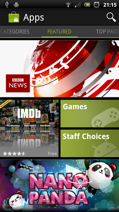
The new Android Market app gives us a glimpse of the future. It is very unlikely that Google would create a new app for the upcoming Ice Cream Sandwich release meaning that this version is going to ship with ICS. Many visuals in the app are very close to Honeycomb visual style. We are probably seeing some of the future ICS APIs in action already.
Workspaces
Workspaces implementation is functionally same as in the Google+ and Google Docs. Visually the tabs are made to look very similar to the Android Market's Honeycomb version.


Action Bar is also functionally standard but visually very Honeycomb-like. It even has the small left arrow next to the home button.
I think we are seeing a sneak preview of how Action Bars are going to look in the Ice Cream Sandwich release. This app is probably using an API that will be made public in the next Android release.
[update Jul 16.] Apparently my thoughts about the app using unreleased APIs were wrong.
Kirill Grouchnikov had this to say in the Google+ (original post).
As we're committed to a level playing field, the entire UI is done with only published APIs available in Froyo+. I'll start a small series next week on my blog about a few more interesting pieces in the new Market client.I personally can't wait to read his upcoming blog post about the app. If you aren't yet you really should subscribe to his blog at http://www.pushing-pixels.org/!
Google+
Google+ app reflects more of the current design style of the Android platform.
Dashboard

Google+ dashboard has few interesting modifications:
No action bar on landing screen as it is not needed. It has been replaced with a Google+ logo.
Profile icon is customised combining User's profile image with a Google+ circle icon.

Action drawer
Action drawer implementation is very simple and clear.
Quick Actions and Background process indicator

With Quick Actions Google+ removes the normal container and icons and displays available actions as text instead.
As for the background process indicator the app uses a simple progress spinner in the Action Bar.
Action bar
The Action Bar is standard. Google+ logo takes user back to the landing screen.
Workspaces
Workspaces implementation is identical to what we saw in Google Docs app.


Latest Google shopper app was recently released. It is not available in my country so only source of information I have is the screenshots.
The app uses bottom tabs instead of top tabs like recommended by Google's developer advocates.
Android platform already has severe consistency problem. In my opinion Google should be the leading example of Android design and only release apps that strengthen Android platforms consistency and design guidelines. This app is a big disappointment to me.
This comment has been removed by the author.
ReplyDeleteExcelent article.. But I think that Nearley app has better UI design than this.
ReplyDelete