Android tablet sales are far behind iPad for now but that is going to change soon. I have had the privilege to try out Samsung Galaxy Tab 10.1 now for few weeks. I'm very impressed by it. It is only a matter of time before Android tablets take over the market the same way Android phones did in one year.
Designing for tablets is different from phones in general. So are the UI design patterns. Any patterns should always only be used if the problem the pattern is solving exists. In that light it is interesting to review the existing UI design patterns for phone and see if and how they make sense on tablets.
Very clear and easily accessible navigation to application's main functionality is very important in mobile applications. They are used for short periods of time usually to achieve a very simple goal (post a update to a social network, send a message, take a picture, etc).I think the problem still exists on tablets but isn't nearly as relevant as in smartphones. Use context of tablets is a bit different from smartphones but even bigger difference is the screen size. A tablet app can have a lot of content on the landing screen but still clearly display application's main functionality.
Something has to be done
Even though Android's layout managers are very scalable if used correctly just leaving dashboard as it is on a smartphone isn't a good idea. Take a look at these two applications that developers have not yet converted into Tablet versions.
Keeping dashboard
Google used their Google I/O app in the conference to demo their approach to tablet and smartphone UI patterns. Their approach was to keep the dashboard but add additional content to the landing screen.
I'm not sure that this is the best solution. Even though the tablet landing screen looks great it isn't very functional. The screen doesn't have much information. Users will always have to navigate to another page to reach anything informative.
Springpad tablet design stays very close to their smartphone design. They have, however, made subtle changes to the landing screen to make it work on tablets.
Redesign
Catch app's tablet app's landing screen has been fully redesign to fully utilise the bigger screen. They have moved the two most important components "My notes" and "Tags" into tabs. The Landing screen also allows users to access their notes immediately.
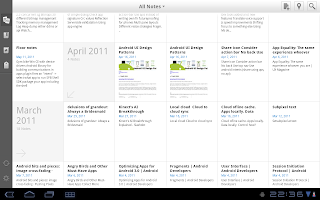
Evernote has also redesigned their tablet app. It's still in beta and I hope they'll at least use the Honeycomb action bar in their final version.
Split view
Tablet display can easily fit more than one component in the screen. Many Android tablet apps use this approach in their landing screen. This is a implementation of overview besides detail UI design pattern.
GameFly app is another example of split view approach of the landing screen. Are the top level tabs the tablet dashboard replacements? At least in this app's case they seem to solve the same problem. The three top tabs tell the user immediately what this app can do.


Beautiful, I’ve been thinking of putting up a springy wreath (even though it still feels and looks like winter in my area as well). thanks for the great idea.
ReplyDeleteiphone application development
Really good Dashboard UI example.
ReplyDeleteThank u.