
While trying out as many apps from the Android Market as possible sometimes I run into UI design flaws that are comical, extremely annoying or anything in between. Here are few.
Offering users an option that doesn't really exist
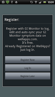
Why does this app offer "Register Later" button on the first screen if when user presses the button the app only tells the user that the option isn't really valid.

No prepared for lost connection
Internet connection in mobile devices can be very unstable. The worst thing an app can do when connection is lost is to exit the app.


Offering users an option that doesn't really exist
Why does this app offer "Register Later" button on the first screen if when user presses the button the app only tells the user that the option isn't really valid.


No prepared for lost connection
Internet connection in mobile devices can be very unstable. The worst thing an app can do when connection is lost is to exit the app.


Overuse of notifications
Apps should not use notifications unless there's something to notify the user about. An app requiring activation isn't a reason to notify user.

nice, Thanks. Do share more as you come cross.
ReplyDelete