
Google's track record on Android app quality has been questionable. User interface in most official Google apps has been very poor. Today we had a nice surprise though. Google just released Google docs for Android. The app is very polished both visually and functionally.
The app also provides us a view to Google's new visual style for Android apps. They have taken many of the design patterns and given them a facelift. I wouldn't be surprised to see this app as the reference in the upcoming Google I/O. I hope we see this app or at least the UI layer released as open source really soon.
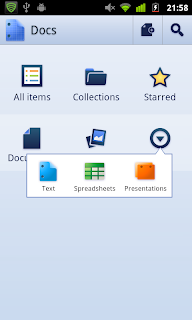
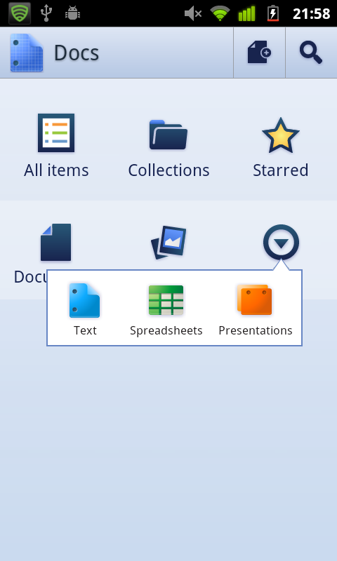
Dashboard
Dashboard of the app still contains the same amount of icons as usual but they have been arranged differently. For some reason they have left the bottom part of the screen empty. Other than I think this design is very stylish and very clean.


Conclusion
This app is clearly sets a high standard for Google's Android apps. I hope they keep this as a benchmark and do not allow subpar apps through with the Google brand anymore.
And please Google, if you're reading this, open source at least the UI layer so we can use them in our apps!
The app also provides us a view to Google's new visual style for Android apps. They have taken many of the design patterns and given them a facelift. I wouldn't be surprised to see this app as the reference in the upcoming Google I/O. I hope we see this app or at least the UI layer released as open source really soon.
Dashboard
Dashboard of the app still contains the same amount of icons as usual but they have been arranged differently. For some reason they have left the bottom part of the screen empty. Other than I think this design is very stylish and very clean.


Action bar
Action bar doesn't differ from previous implementations. It is visually very clear and has the normal functionality. It indicates user's location, provides access to two actions (which are not context related) and tapping the icon will take user to the app's front page.


Scrolling tabs
Scrolling tabs implementation is very nice. Either by swiping or tapping the tab headers user can change between different filters. Related animations are smooth and interaction is effortless. I really recommend trying this out in a phone to get hands on feel of the functionality.


Quick actions
With quick actions Google has chosen an interesting approach by associating quick actions menu with the "more" icon. This is clear move of from the previous identifying icon border approach. The actual menu itself is extremely clear.

Conclusion
This app is clearly sets a high standard for Google's Android apps. I hope they keep this as a benchmark and do not allow subpar apps through with the Google brand anymore.
And please Google, if you're reading this, open source at least the UI layer so we can use them in our apps!
Worth noticing that the much advertised (by google) Twitter Dashboard has been brutally stripped from the latest versions of the Twitter app.
ReplyDeleteIt is a nice pattern, but of course it doesn't fit all sizes :)
I actually think that the new twitter UI is pretty bad (I've written few entries about it). After twitter took over from Google the quality has somewhat suffered. I think that twitter is trying to keep the same UI in both iOS and Android.
ReplyDeleteBut you're, of course, right that patterns should not be used without a reason to use them!
great post, thank you!
ReplyDeleteThank you for your kind comment :)
ReplyDeleteHey Juhani,
ReplyDeletepretty much agree with your assessment of the Docs, if we stick to the visual appeal and leave aside that the app itself is mostly a glorified web view and offline editing is sorely missing in this release (hope Google will add this soon), the most striking omission to me how strange it looks on the Honeycomb tablet with the bigger screen estate. It seems it was not optimized for Honeycomb at all, which is quite puzzling for an app coming out of Google.
Cheers,
Pavel
Heyyy Pavel!
ReplyDeleteThanks for the comment and nice to hear from you!
I completely agree with you. I was very happy after trying the app as visuals and feel of the app vas so high level. Now after diving deeper to functionality it seems pretty much useless. Not even offline doc viewing?
I think it is pretty safe bet that we see this app as an example in few I/O talks anyways.
Hi Juhani, great post, i check for new entries daily cuz i'm building my app. i love those scrolling tabs, any idea of how to implement them????
ReplyDeleteThanks in advance
Hey Zuka,
ReplyDeleteThanks :)
Check out this open source project http://code.google.com/p/andro-views/
If you combine that code with a HorizontalScrollView which has buttons inside and then manually keep them in sync you should get close.
Let us know how it goes!